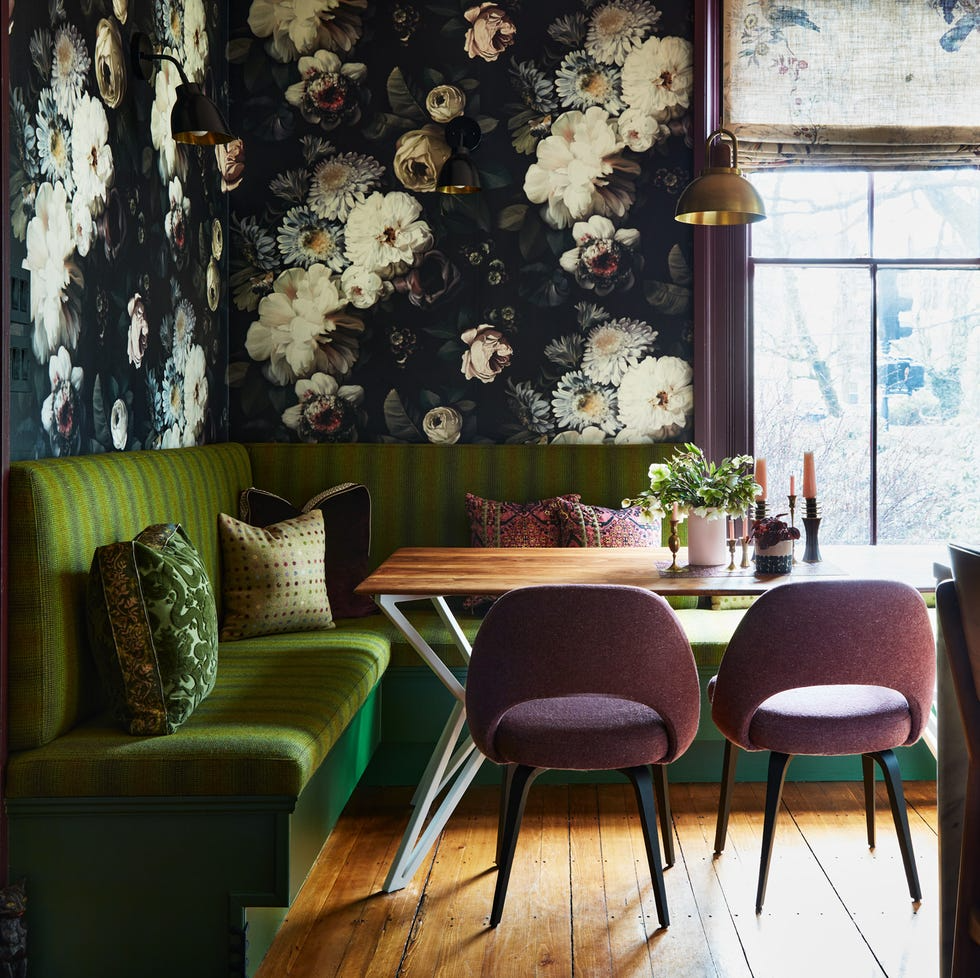
Designing your perfect space should be a thoughtful process, especially when determining your interior design color schemes. It’s best to avoid overly trendy features that necessitate frequent changes in furniture or wall colors. Constantly adapting to new trends can be impractical and costly. However, the influence of social media can make it challenging to distinguish between timeless palettes and fleeting fads.
When selecting colors for your bedroom or living room, countless resources are available yet many overlook accent hues. To inspire you and simplify the process of selecting interior design color schemes, we consulted several interior designers. We asked them which specific schemes they always use and have plenty of visual inspiration to help you envision their ideas. Say goodbye to the stress of matching colors—simply read on to discover the expert-approved interior design color schemes that resonate with you.
Aqua and Pink
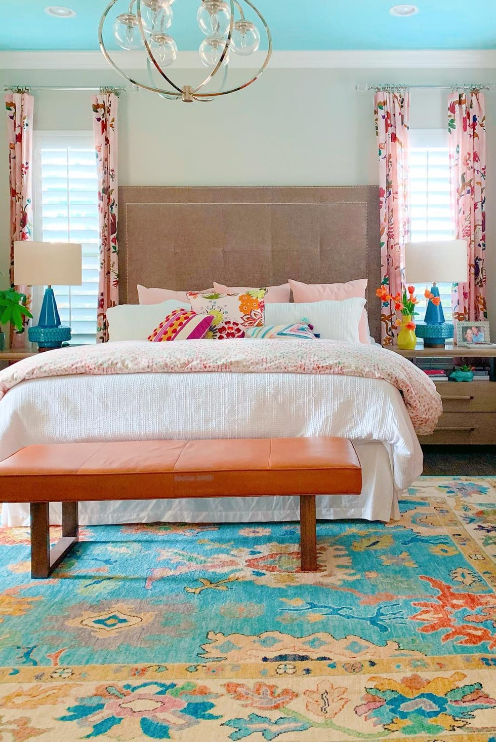
Designer Shauna Glenn says, “Probably my favorite color combination is pink and aqua. For some people, that might seem juvenile, but to me, it reminds me of happy summers, colorful beach cabanas, and the color of the ocean. Plus when you consider the ranges of each hue—deep raspberry to blush and saturated turquoise to pale aqua—the possibilities of color combinations are endless.”
Green, Blue, and Pink
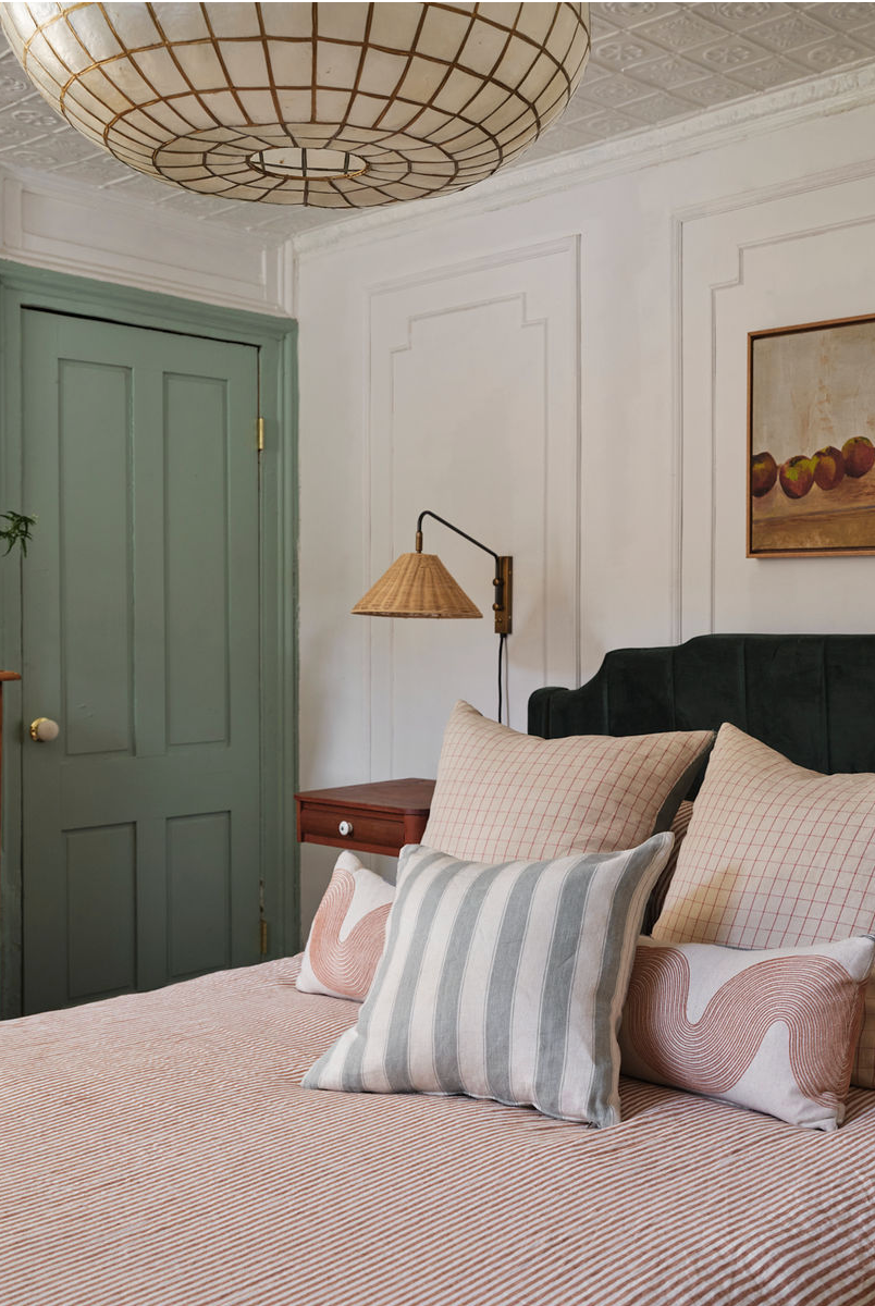
“When working in historical houses, I love to create a balance of color and light—often painting the walls a soft neutral white (Farrow & Ball’s All White is a favorite) and then punching the trim, moldings, and millwork up in historically appropriate colors to create contrast and interest without making the rooms feel overly dark or severe,” Christina Salway explains. “Some of my favorite combinations are Farrow & Ball’s Inchyra Blue, Farrow & Ball’s Vert De Terre, and Farrow & Ball’s Setting Plaster, which I often do on beadboard and paneling.”
“All of these colors complement each other so intuitively, playing off the soft, romantic quality of the scheme, and enhancing the architecture of the space,” she adds.
Purple and Green
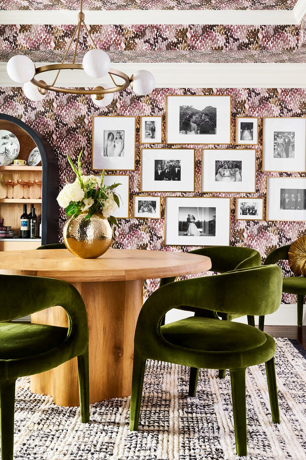
“There’s just something so majestic and inviting about combining purple and green in a space,” Amber Guyton from Blessed Little Bungalow says. “The rich hues blend naturally in a home, just as they do in nature (think wisteria, hyacinth, lavender, and vineyards), and the combination of cool tones plays well with all metals and design aesthetics. I used them both in this connecting dining room and living room with both solids and a mix of patterns layered with black, taupe, and brass finishes for an effortless, collected look.”
Blues and Greens
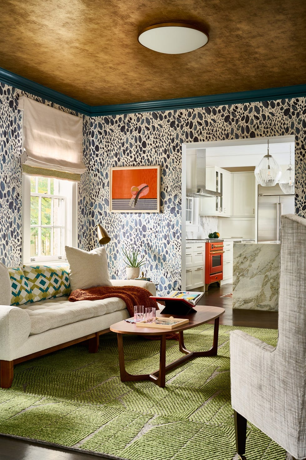
“When utilizing bold colors for a client, we gravitate toward rich blues and greens,” Elle Cantrell, lead designer and owner at Atlanta-based Elle Du Monde, says. “Heavily saturated cool tones pair beautifully with stained woods and can add depth to a space without feeling overwhelming.”
Shades of Green
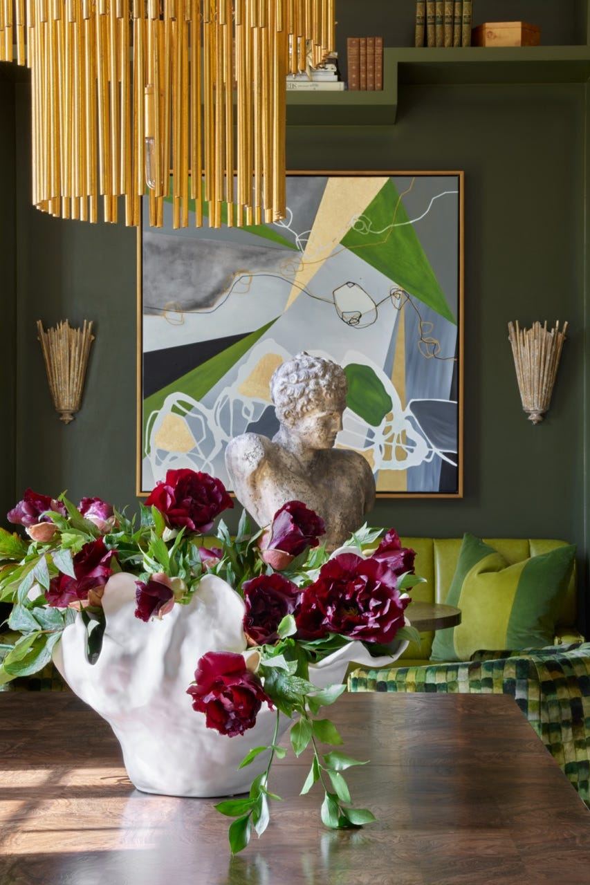
“You can’t go wrong with shades of green,” Connie Vernich of Vernich Interiors says. “Green has been a favorite color to design with for years. It’s an outgoing and likable hue that plays well with others (others being pretty much any color on the color wheel).”
Mid Brown and Stony Gray
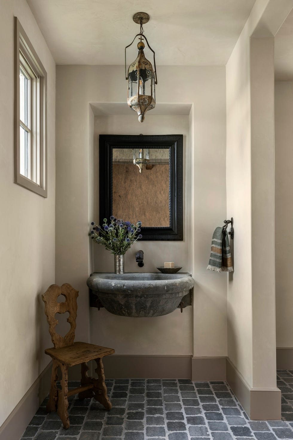
“We tend to gravitate toward neutral, calming color schemes, especially in spaces like bedrooms and bathrooms. To add interest, we’ll bring in layers and patterns in both neutral tones and corresponding colors,” says Jennifer Sissom, lead interior designer at Ryan Street Architects.
“In order to land on the perfect tone, we often sample paint colors at different percentages of saturation. Also, to cultivate the palette for a room, it’s completely acceptable to combine brands,” she adds. “Matte plaster walls in Benjamin Moore’s Stone Hearth and trim in Farrow & Ball’s London Stone makes this powder room warm and inviting.”
Gray, Beige, Off-White, and Pale Pink
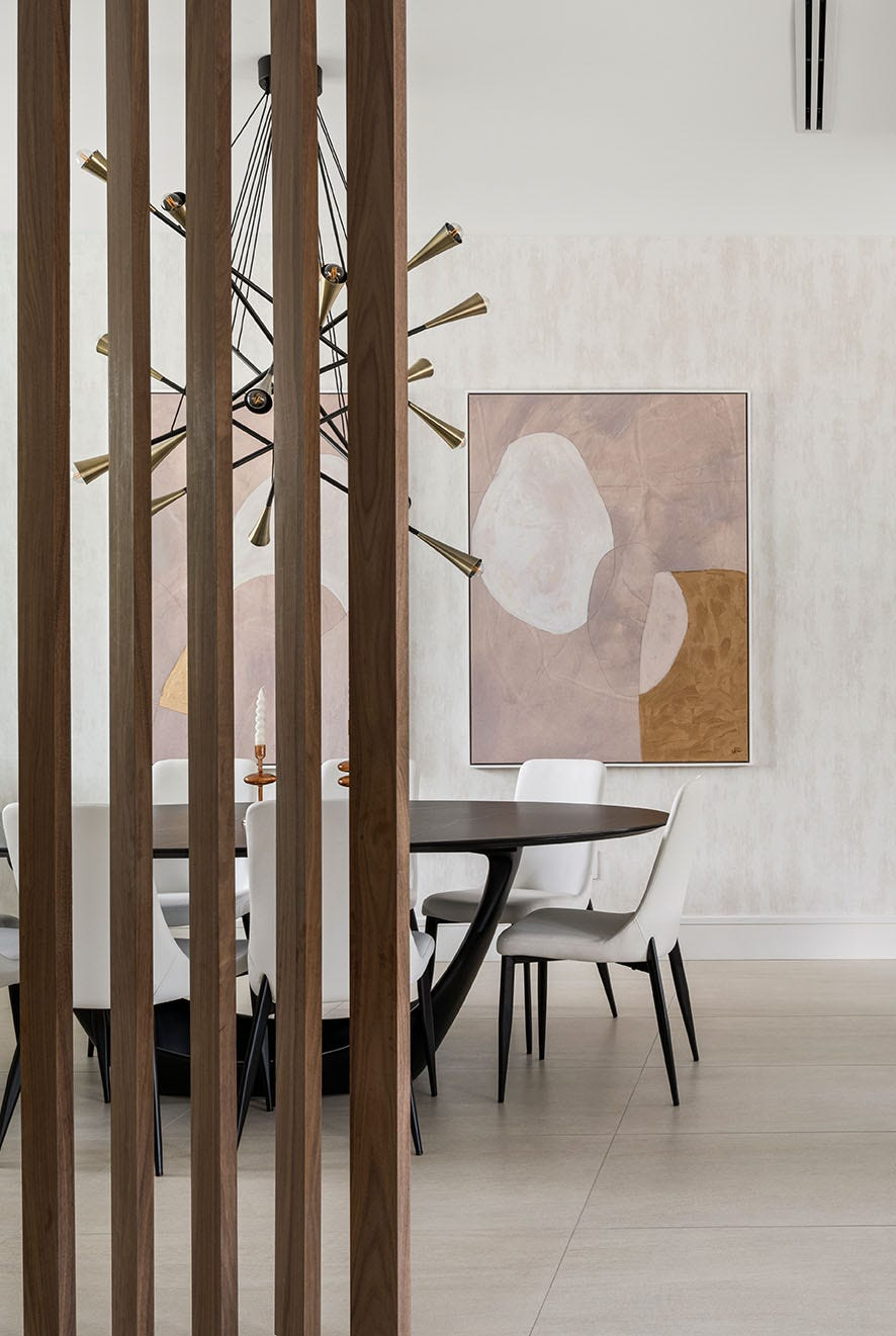
“I tend to lean toward a natural color scheme with a focus on soft, muted tones, paired with bolder contrasts, like walnut wood or black detail, to create sharpness and depth,” Laetitia Laurent from Laure Nell Interiors says of her favorite interior design color scheme. “While I appreciate the use of a bold color scheme in the right setting, my go-to pairing remains the timeless combination of warm grays, earthy beiges, off-whites, greiges.”
“Lately, I’ve been drawn to soft blush and rose tones as well,” she adds. “This versatile palette allows the space to be easily updated over time. It also enhances natural light, which makes the space feel larger and more open. It’s a sophisticated and cohesive palette choice that can effortlessly adapt to different styles and transcends trends.”
Terra-cotta, Ochre, Sienna, Browns, and Gold
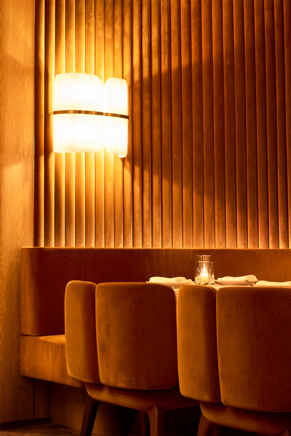
“My favorite color schemes tend to evolve over time, reflecting both my personal journey and the changing in cultural, social, and artistic landscape,” Marc Ange, founder of Marc Ange Design Studio, says. “Currently, I’m drawn to warm, earthy tones that revolve around sienna, terra-cotta, ochres, deep browns, and shades of velvety golds. I also love when this harmonious blend gets some splashes of contrasting colors, like greens or blues.”
Color-Drenched
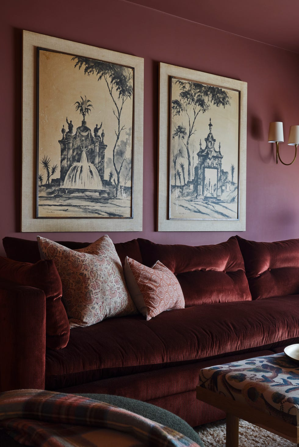
“I enjoy working with diverse color palettes and find that color-drenched schemes often create the most powerful design statements,” Jaqui Seerman explains. “Whether it’s shades of blue, green, red, or any other hue that’s inspiring me, I love immersing a space with broad swaths of color. This approach creates an environment that feels cocooned in luxurious, enveloping tones.”
Earth Tones
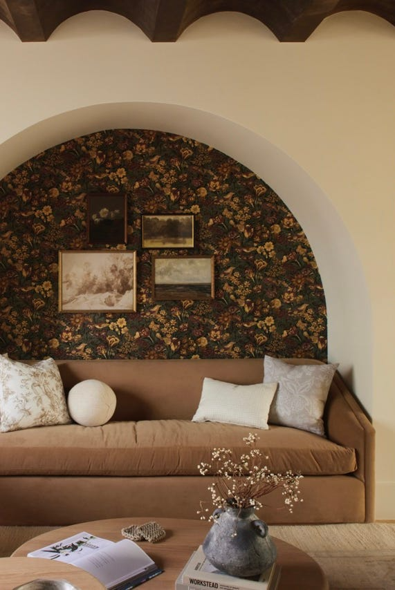
“I love incorporating earth tones because their versatile range of colors seamlessly integrates into various design styles while withstanding the test of time,” Lindye Galloway says. “The depth and richness of these hues add warmth, ensuring your space remains inviting, cozy, and timeless.”
Burgundy, Smoky Green, and Pink
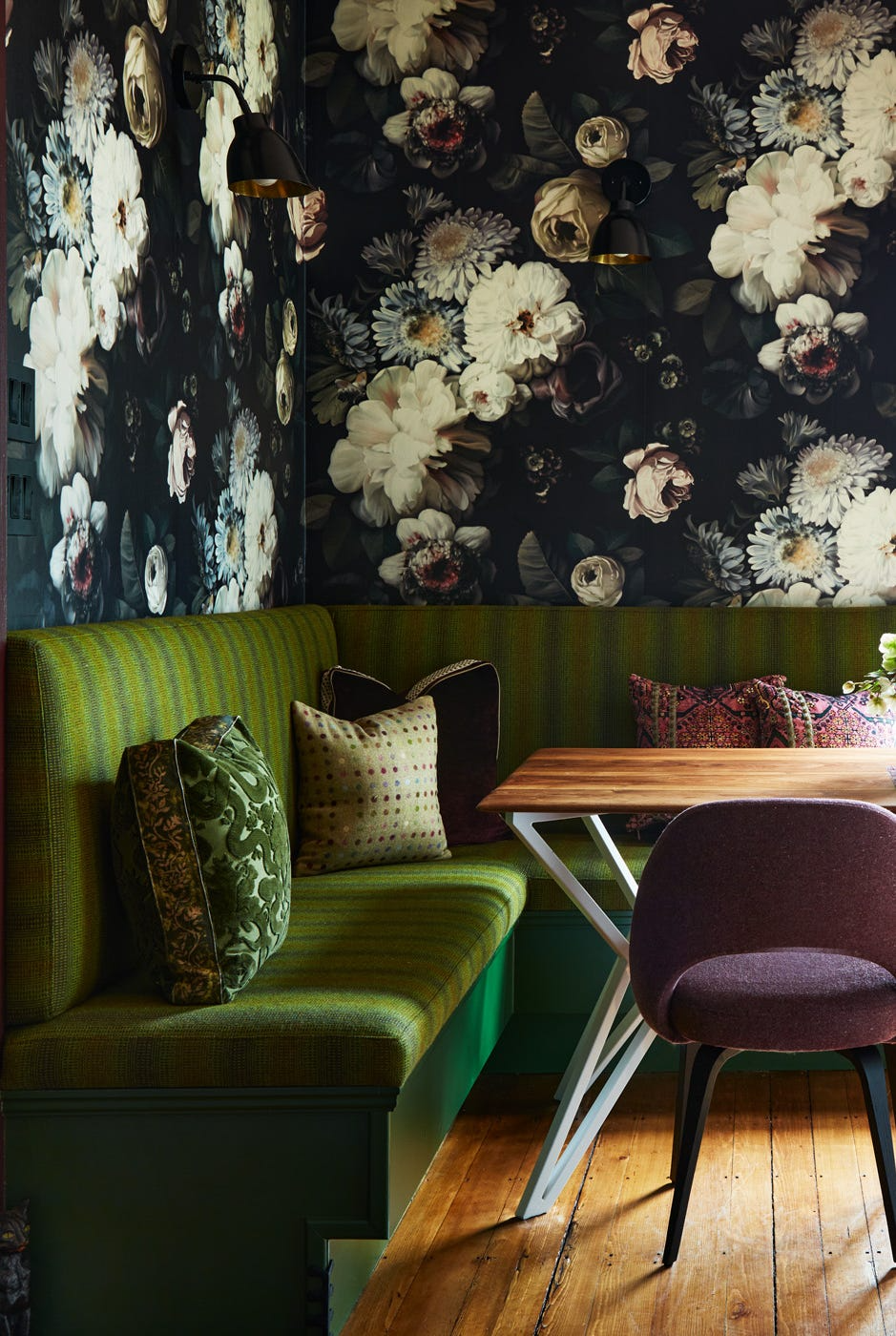
“One of my favorite go-to color schemes is burgundy, smoky green, and pink—a fantastic combination when brass and walnut wood tones are added,” Cecilia Casagrande of Casagrande Studio says. “I love the richness of this color scheme in unexpected places like kitchens and baths—a nod to the natural beauty of the outdoors.”
Jewel Tones
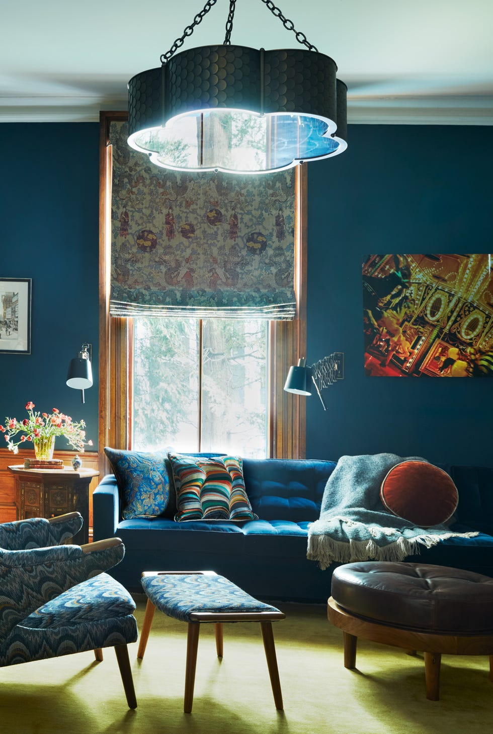
Cecilia Casagrande adds, “I love jewel-tone color schemes for living rooms especially. The richness of sapphire, ruby, and emerald make a room not just feel grand and luxurious but warm and inviting. Jewel tones spark interest with its bright contrasts and royal splendor.”