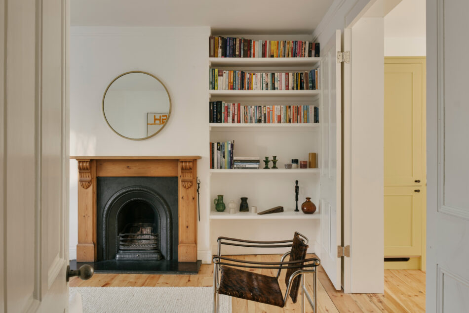
Almost exactly a year after Alex Nikjoo and his wife Charlotte moved into their first home, a Victorian maisonette in leafy Brockley, they got married in the living room. A few months later, their son was born. “I suppose we’re spontaneous,” laughs Alex, who had been living down the road – quite literally – for almost a decade. Lucky, then, that his light-touch approach spared the expanding family months of major works. “Structurally, the only things we did were open up the downstairs and take out the huge chimney breast. And one of the benefits of my job is that I can get the builders in quickly …”
The garden flat, which occupies the lower storeys of a smart townhouse in a conservation area, was in fact a plan B. “We’d missed out on place we loved nearby, so I think the estate agents wanted to get us this one. Initially, it wasn’t inspiring – think varnished floors, pleather sofas, piles of stuff everywhere. But the more we thought about it, the more we liked it, especially the big garden.” As a near-neighbour, Alex was aware of the street’s almost perfect east-west orientation, which meant a ping-pong style distribution of light with either living or dining room illuminated. “Connecting the two rooms was such a simple move, but it’s made it so much more liveable.”
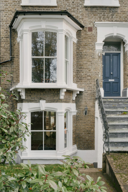
Alex Nikjoo: “Buildings like these are on an ongoing project, though they rarely require radical intervention. Maximising daylight is the main thing. We added double glazing too, because the windows are big and we were struggling to get above 16 degrees.
“I’ve done a lot of work in Victorian homes and have a good understanding of how to improve them but also the problems you tend to hit. This house dates to 1860, so I knew to look for rotten floorboards, for example. And I know what not to do: MDF skirting boards, for one.
“We considered trying to add square footage, but the building didn’t lend itself to an extension and we’ve already got generous living spaces. What do you get if you go out into the garden? More of the same. We might have been able to carve out a third bedroom, but it wouldn’t have been a good bedroom.
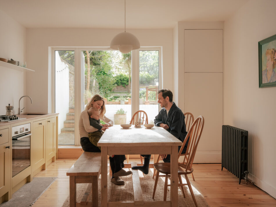
“The kitchen was a tiny room at the back of the house, but Charlotte’s a fantastic cook and we wanted to have that classic social family space. We ended up turning the old kitchen into a study with a utility cupboard, which has allowed that long living space to be freer. At one point we had two kitchens, which was interesting.
“Because these buildings are so tall, the old chimney breasts come out over half a metre by the time they get down here. It was truly humungous. We had seen other people put their cooker inside the hearth, but realised we’d lose all the worktop space if we kept it. You can still see the stone footprint between the floorboards.
“The kitchen is from British Standard – rest in peace – with a worktop made from an old teak science desk. I spent hours calling salvage yards to find something of the right length and depth, which didn’t have a sink hole or endless Bunsen burner marks. Unless a salvage yard gets involved and recognises the value, so much of this stuff gets chucked in a skip, which is a shame. You can’t get a worktop like that today because staves are half the width. If you buy modern, you often have to compromise.
“A lot of the aesthetic relies on reclaimed and reused items, paired with super modern elements like the steel shelf above the worktop. In a way, the building itself is reclaimed – so many people have lived here. I like the idea of seeing parts of those lives, rather than taking it back to zero. There’s an odd little step between the living room and kitchen, which probably comes down to someone laying the floors not quite level. But they’re good floors, so we sanded them back and we’ll live with it.”
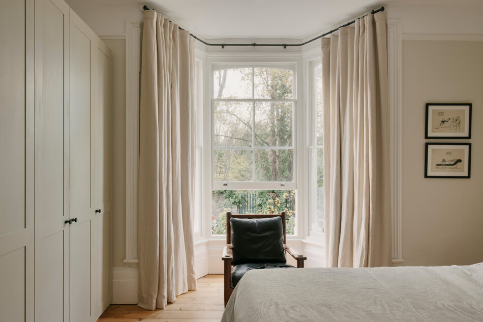
“We combined our furniture collections when we moved in, though a lot of my plants ended up on the street. We recently moved the vintage armchair in the bedroom upstairs to make way for the two Le Corbusier chairs, one of which is a long-term loan. The sofa is Gervasoni, and the metal table is by a London-based studio by Six Dots. It’s aluminium, so it’s nice and light.
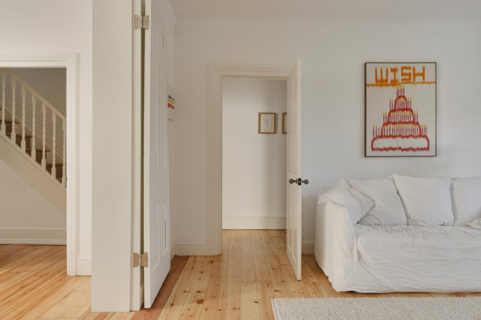
“Art and architecture go hand in hand for me. My grandad was an artist, so I’ve got a couple of his sketches and a portrait of my grandmother. Charlotte and I share a birthday, and we like to buy something together. The birthday cake tapestry by Mark Corfield-Moore helps with the whiteness of the space, I think. Otherwise it can become too stale and too minimalist.
“Am I a minimalist? I’d call this Victorian minimalism. It’s about retaining the interesting features of a building but keeping them minimal, so that the furniture and artwork can sing within that space, rather than going full John Pawson. You could only really do that look here by removing a lot of the character and history of the building. So why would you?
“What I think surprises people is how light and airy the space is. It really shines in the morning, when you’re having a quiet coffee and looking out into the garden. You might hear the train once in a while, but other than that you really feel like you’re in an oasis.”