We might not all be able to afford a custom curated space, but there are designer secrets to making it look like it. Shop all the ingredients for an artfully cozy living room, as recommended by an interior designer
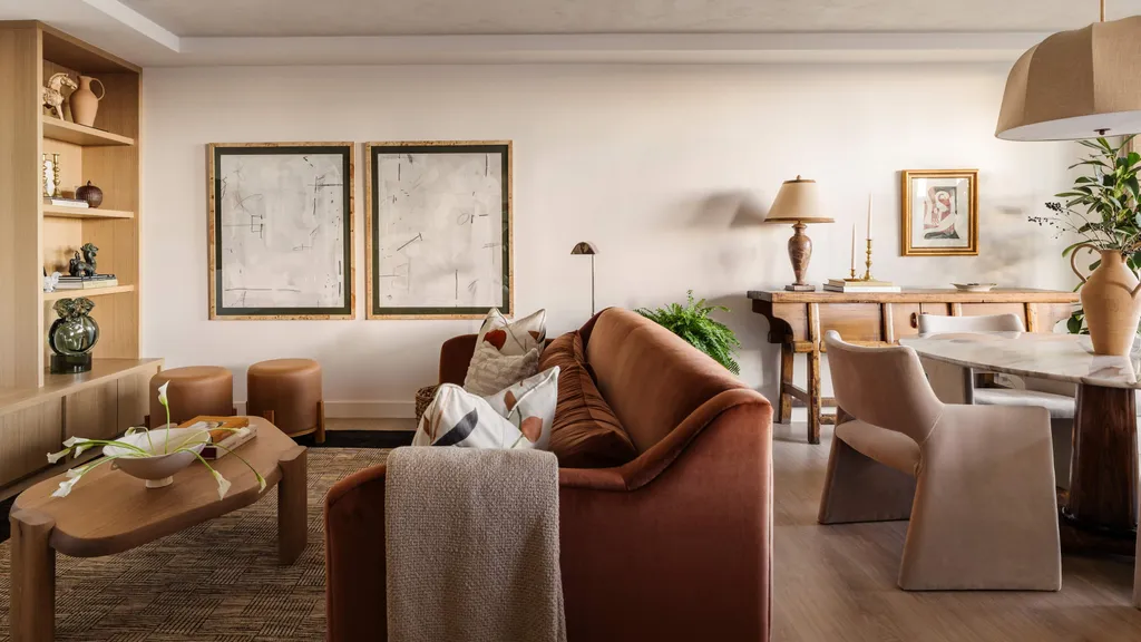
What makes the perfect living room? Words like rich, textural, inviting, warm, and curated all come to mind. These are also precisely the adjectives designer Alykhan Velji (Aly for short) of Alykhan Velji Designs used to describe his recent living room project, nestled in the picturesque Rideau neighborhood of Calgary, Alberta.
The client enlisted Aly’s help mid-renovation after downsizing from a larger home they had lived in for years. This new top-floor condo already had great bones, especially in the living room, which was flooded with natural light. And while the space was smaller, it offered an inherent cozy living room feel that couldn’t be ignored.
The challenge? To make the living room feel streamlined and tasteful without losing that natural snugness. While contemporary design can often come across as cold and impersonal, this project proves otherwise.
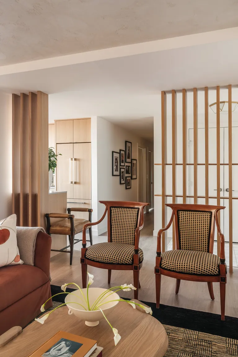
While not all of us can afford custom furniture or a team of seasoned designers, there are several living room ideas that make this project what it is. I interviewed Aly, who shared four elements that make this project a standout. Whether you’re working with a small space or just love the vibe, here’s how to recreate the look in your own home.
1. Contrast
“Utilize bold colors for larger pieces in the room, like the sofa,” suggests Aly. “This creates a stunning focal point that draws the eye and adds depth to the space.” In this particular project, the sofa’s warm hue and distinctive lines stand out, yet also harmonize with the other contrasting elements in the room, making it equal parts statement piece and cornerstone of the living room’s design.
To achieve a similarly curated feel, Aly recommends mixing different furniture styles. “Combining mid-century pieces with traditional elements ensures a harmonious yet eclectic space that feels both intentional and dynamic,” he adds. But contrast isn’t just about furniture; it’s about materials, colors, and textures too — the latter of which truly shines in redesigning this modern living room.
To amp up your texture, you can try elements like woven accents or boucle upholstery, but Aly’s favorite texture tip is a bit more unexpected: plaster. “Plaster is currently a favorite of mine,” he shares. “It can be used on walls, ceilings, and even furniture. Its versatility and texture add a unique, handcrafted quality to any space.”
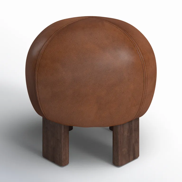
This ottoman is a masterclass in contrasts, with its bulbous leather seat and thick, sleek plank legs. It’s the perfect mixed-material piece to add some dynamic flair to an old armchair or to cozy up an empty corner with its rich cognac hue. Vintage-inspired but with a modern twist, it’s a conversation starter with edge.

If plastering your ceilings or walls feels like too big of a commitment, why not start small with this low-stakes bowl? Designed in collaboration between Serax and Marie Michielssen, it’s made of paper mache, offering that same organically imperfect, whitewashed look. It’s perfect on a coffee table or bookshelf, whether styled solo or with a pop of color from citrus or greenery.
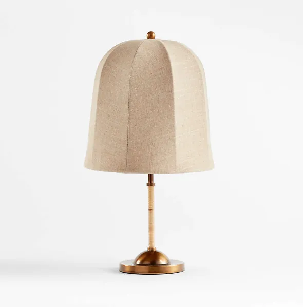
You might not have expected an antique-inspired table lamp to crop up in a piece about how to design a modern living room, but as Aly points out, a touch of old-world charm adds that cozy, curated feel we all crave. This lamp from Crate & Barrel looks like a flea market find but keeps things fresh with modern touches like a linen shade and a barely-there rattan base.
2. A Room-Anchoring Rug
Finding the perfect living room rug was a labor of love. “We took our client to one of our favorite rug shops in the city, where we sifted through countless options,” says Aly. But when she saw one particular rug — a thick bordered, woven look variety — he knew it was the one. “Initially, the client was unsure,” he admits, “but once it was laid down in the home, she fell in love with it.” According to Aly, rug shopping is equal parts art and science, so trying potential rugs out in their intended environment is an absolute must.
One way to do this (sans showroom) is by purchasing rugs from retailers with good return policies (Wayfair, with its speedy shipping and hassle-free returns, comes to mind). “Choose a rug with texture and pattern to anchor the room,” Aly adds. “This not only defines the area but also adds visual interest, enhancing the overall aesthetic.”
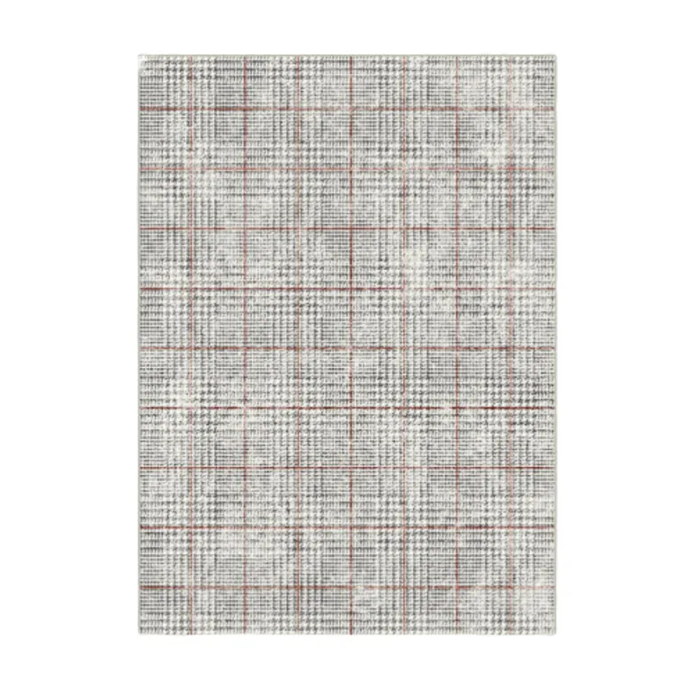
Finding a rug that matched the vibe of the one in the project was no easy feat. I landed on this one from Ruggable, which captures that cozy, heritage feel with its woven, almost plaid-like design. The subtle red stripe adds just the right amount of warmth and dimension to any space.
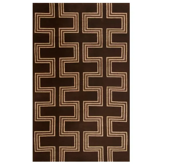
Now, if you want a rug that truly anchors the room, look no further than this Ralph Lauren beauty. Its striking geometric design in deep chocolate brown is hand-knotted for texture that feels luxurious underfoot. This patterned rug is the perfect foundation for your coffee table and seating area, making everything feel cohesive and inviting.
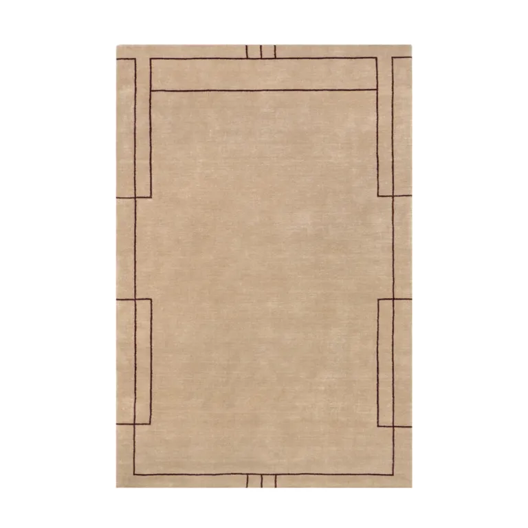
For the minimalist who loves a touch of art, this Rugs USA piece is an absolute steal. Its visual impact comes from a relatively sparse pattern, mostly concentrated at the border, which helps define your space in a subtle yet effective way. And don’t worry about the low price — reviewers rave about its thick, luxurious feel.
3. Large Artwork
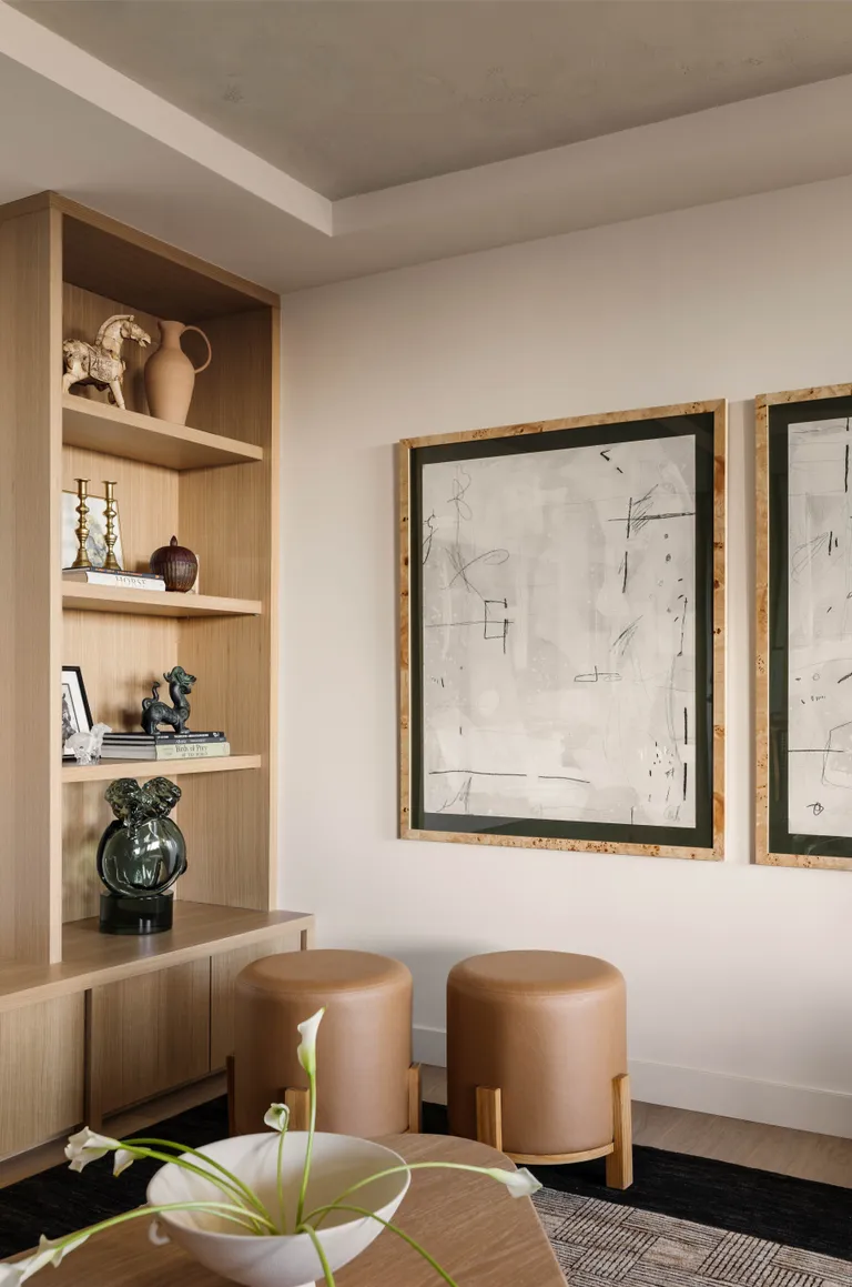
“Large pieces of art can dramatically transform a room,” says Aly. For this project, Aly and his team chose “two substantial artworks that anchor the space and contribute to a sense of grandeur.” While in the art world, “substantial” often translates to “very expensive,” it doesn’t have to be. AVD commissioned local Canadian artist Murray Duncan, whose abstract style beautifully complements the space. “We framed the pieces in stunning burl wood frames with forest green linen mats, achieving a look of absolute perfection,” Aly explains.
So, resist the urge to splurge on an overpriced, cliché print. By commissioning a local artist, not only do you get something customizable to your space and taste, but it’s also likely more affordable than you might think.
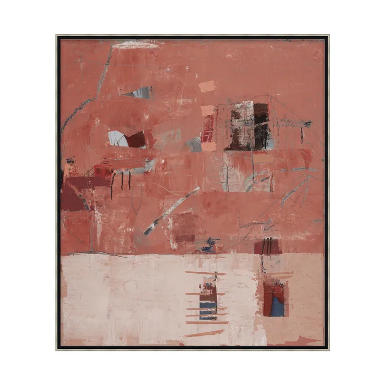
Embracing the abstract theme from the original space, I’ve chosen this warm-toned terracotta piece by Studio L57 Affinity. Its layered visual weave and divided frame exude a cozy vibe while nodding to the iconic American abstract expressionist Robert Rauschenberg. It’s a must-have for any art aficionado, holding its own as a focal piece while seamlessly complementing other artwork.
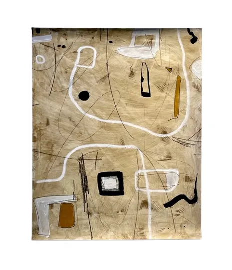
I stumbled upon a finished piece by Murry Duncan, the same artist commissioned by the AVD team for this project! Even better, this large-scale investment piece is on sale. It’s one of those artworks where you discover something new with every glance — a symphony of neutrals, soft lines, and playful shapes that draws your attention without disrupting the room’s harmony. And yes, it comes framed — score!
4. Organic Shapes & Materials
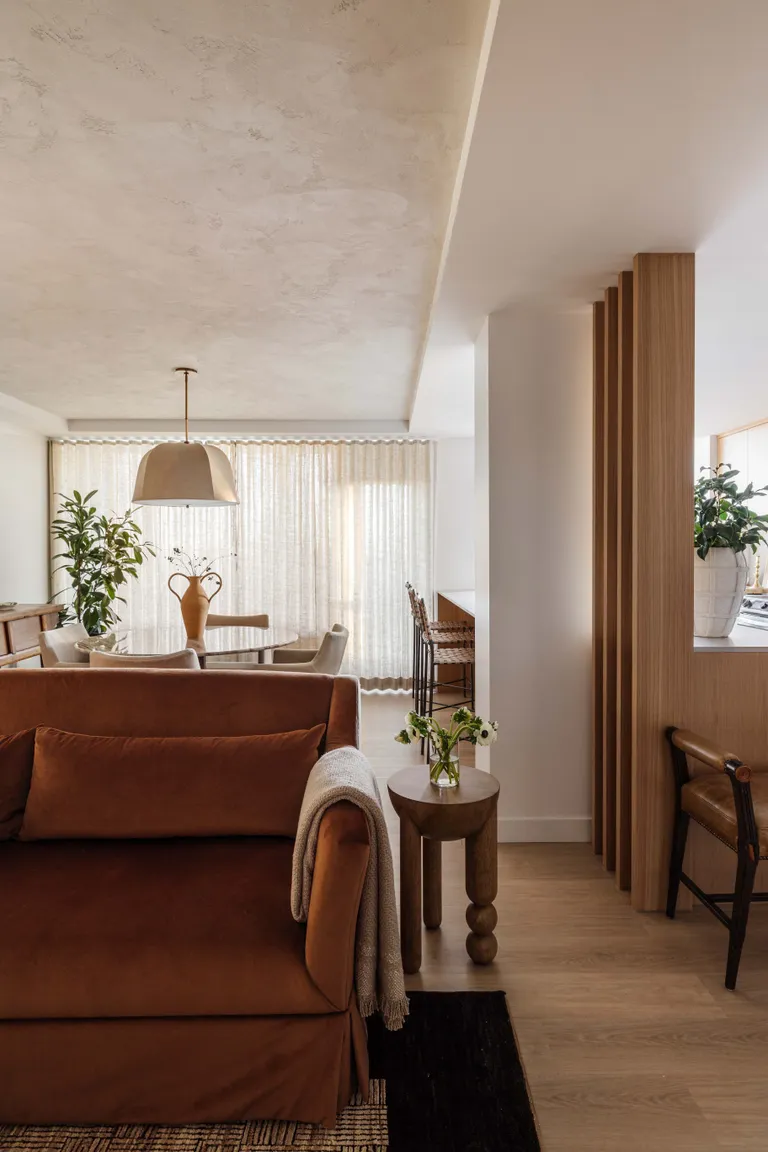
According to Aly, organic shapes create a more fluid and dynamic environment. Incorporating a few of these accents “softens a room’s edges, making it feel less rigid and more expansive.”
Take, for instance, the Lock & Mortice coffee table, which Aly deems one of the most essential pieces in the room. “With its organic form and unique shape, the coffee table adds an unexpected and captivating touch to the space. It serves as a focal point that intrigues and delights,” he muses. While much of the other furniture in the living room is either custom or vintage (good luck finding it!), this piece is a pleasant exception. “It’s by Lock & Mortice, based in Vancouver, and it can be shipped,” Aly notes — music to my ears.
But if a new coffee table isn’t on your shopping list, the principle of using organic materials still applies. Consider adding oak, velvet, or linen through smaller accents like pillows and curtains. It’s a cost-effective way to create a similar vibe. After all, the perfect living room is all in the details.
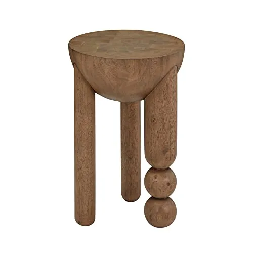
This side table that you can find for the best price on Amazon is a perfect match for one used in Aly’s living room design. With its rounded leg-detailing, it’s one of our favorite modern living room side tables we’ve seen recently, especially for this price. It’s at least $50 more expensive from other retailers, and even sells for over $420 on Wayfair, so this really is a steal from Amazon.
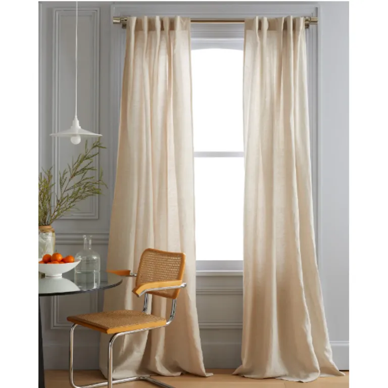
Save the blackout curtains for the bedroom. These breezy 100% European linen curtains are the perfect counterbalance to cozier, heavier elements like thick weaves or dark velvets. They softly diffuse natural light, bathing your space in a warm, delicate glow. With a 4.8/5-star rating from over 567 reviews, it’s clear this living room curtain idea is a winner.
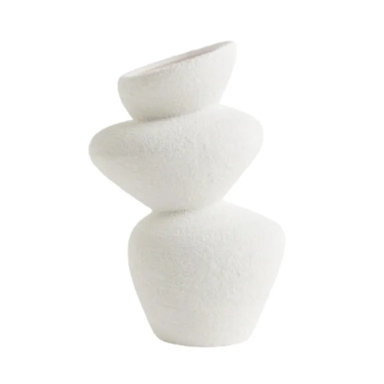
And speaking of great reviews, 4.9/5 stars is pretty impressive for a vase that costs less than a takeout order in New York City. This artistic, design-forward H&M Home vase is a trio of stacked organic shapes, and despite its modest price tag, it’s truly well-executed. Place it solo on a side table or shelf, and it could easily pass as a high-end showroom find — no flowers necessary.