A tale of the unexpected, the reimagined house design of this family home in southwest London was Irene Gunter’s first large-scale project, so it holds a special place in her heart. Despite the house’s period facade, it was only built in 2021 and it’s a surprise to step through the door to a contemporary interior that celebrates color.
The clients wanted the house design to be as family-friendly and comfortable as possible, elegant and luxurious, yet fun and informal. ‘They requested a stylistic harmony throughout – they didn’t want it to feel jarring going between rooms but they wanted a sense of vibrancy and unexpected color in places.
‘It certainly was never meant to be a bland neutral scheme; it was always going to be fun and uplifting and unexpected,’ says Irene. Blues and greens are a color palette that resonated, with warmer tones introduced, resulting in a carefully curated look.
Irene explains, ‘All these colors should support each other They need to be layered and have some sense of compatibility with each other’.
Comfort was of utmost importance. ‘We had to think it through,’ says Irene. ‘It wasn’t just suggesting a dining chair, but one that we’d sat in and tested to make sure it was going to work’.
She continues, ‘We also put forward craftsmen to make the sofas who we’ve worked with and whose sofas have been in our client’s homes for years so that we could say with confidence that it was going to be the right product.’
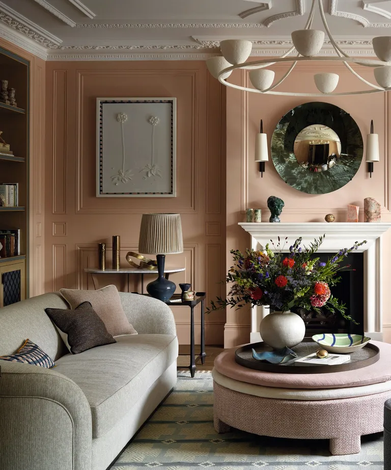
One of the most sublime spaces, and a particular favorite of Irene’s, is the heavily paneled formal sitting room. The living room paneling is painted in a seductive light pink. ‘I chose plaster pink because it’s a north-facing room. The clients wanted it to be light and fresh and I knew that if we were just going to use a shade of white it would fall flat’.
Irene continues, ‘I wanted it to feel comfortable; a room that gives you a hug while still being incredibly elegant and refined and that color was the one to achieve all that’. Curved sofas and a rounded ottoman make sense from a circulation point of view and tick boxes as regards to being practical, as well as avoiding any sharp corners that could prove a danger to the kids.
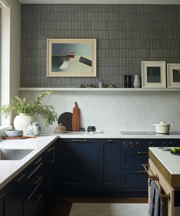
In contrast to the pale aesthetic of the sitting room, a punch of navy blue kitchen adds drama. The house’s high ceilings were key to the design narrative. ‘We wanted to maximize the fact it was a huge, generous space but also make it feel intimate and suitable for a cozy November afternoon.’
Along with the dark tones, interest was also injected with a blend of materials – stone, tiles, and wood. A robust quartz was selected for the work surfaces, with a wood finish on the island and larder unit, while kit kat tiles above the splashback bring a Japanese aesthetic.
The hue of the olive green bar stools connects with the views of the garden. Harmony was an important element, so pale wood links the island and the larder unit, which is designed to look like a free-standing unit, while its reeded doors echo the low-level reeding detail on the island, as well as the pattern of the tiles.
‘The house feels incredibly inviting and warm; it’s a place that envelops you and makes you feel welcome,’ says Irene. ‘This is done by layering and the clever use of varying textures, as well as the sense of fun, color, and playfulness. It certainly isn’t a house for the faint-hearted – it’s got real personality and a sense of cheekiness.