If you’ve ever wondered what that house from the design magazine looks like in reality – don’t miss the “Open House” events that offer a glimpse into the lives of others. During two weekends (April 4-6 and April 11-13) free and unmediated access is possible to no less than 153 private homes, apartments, public buildings, cultural institutions, and tours of the city, which draw an experiential map of Jerusalem, which goes through architecture, design and human encounter.
“The project started in London about 30 years ago,” says Aviva Levinson, founder and manager of the project in Israel. “Victoria Thornton founded the Open House event in London and she even received a badge of nobility from the Queen for her work. It was based on a French event called ‘Doors Open Days’ – one weekend a year, where buildings for preservation and palaces are opened to the public.”
We have gathered eight recommended stops that will help you get to know the city from another angle, through the eyes of designers and architects who made surprising and interesting choices.
The flexible apartment of the young architect
The building: 120 Oneness & Otherness, architect: Shiran Ishay
Going up the blue iron railing and up to the third floor in the preservation building in the Greek colony is the apartment of the architect Shiran Ishay and her partner, Harel. If you’ve ever wanted to get inside the head of an architect (or female architect, in this case), this house will provide a glimpse into what the architect calls “a residential experiment”.
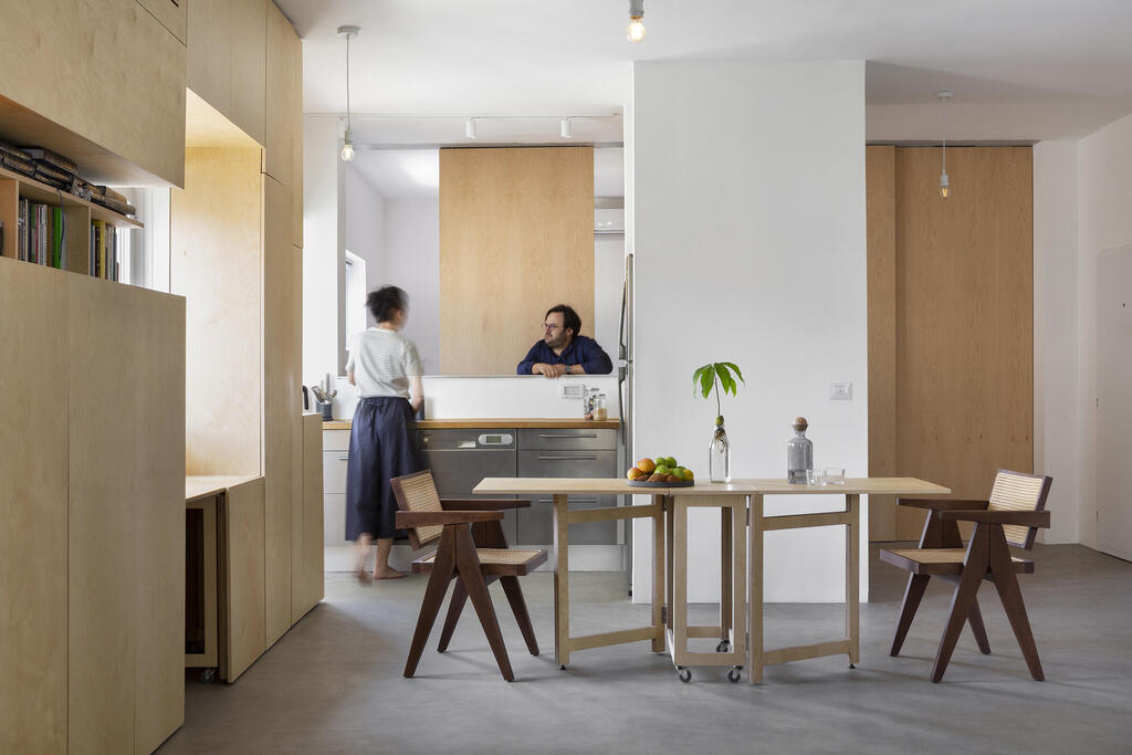
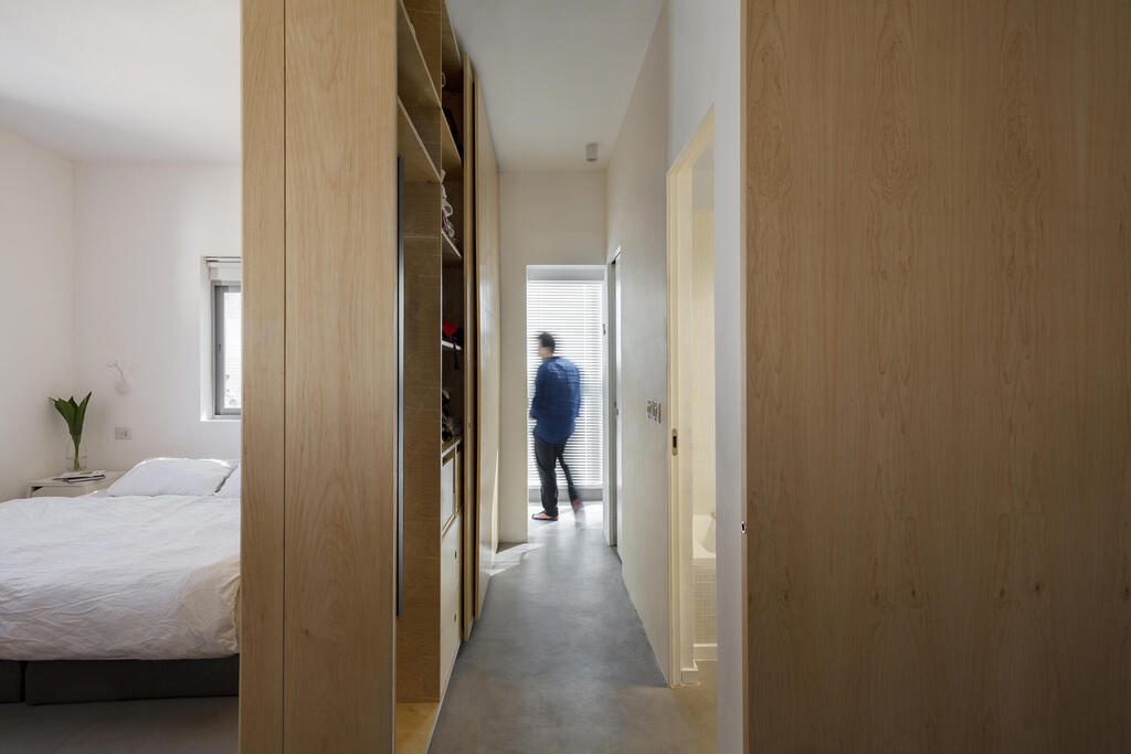
In 750 square feet of a single space, with a clean design based, among other things, on the experience of living in Japan, she chose to remove all the partitions that pre-define and limit the areas in the house. According to her, the partitions dictate in advance what privacy is and how we live together in a shared space. With a quiet and clean design, the couple’s apartment changes every time anew for every situation, whether it is for entertaining that requires the dining area to grow three to four times its regular size, whether it is for yoga practice that leads to moving the couch (from IKEA, to which wheels were added) with a slight push, or whether it is dividing the central space into two by a soft curtain that allows one of the couple to signal that a moment of silence is needed here. Almost everything is modular, removable, movable, foldable and expandable according to the needs of the tenants.
“Closed rooms are well defined and also immune to sound and light. I was looking for a contained space that could also teach about the ability to live together. Everything that defines privacy is softer and was made as a conscious choice, which signals to the other this need for space,” explains Yishai.
The furniture – from the sofa in the living room to the ironing board that folds into a dresser, moves through the space on wheels. The apartment is lit by natural light and the neighborhood view only emphasizes the peace. A smoothed concrete floor using the micro-topping technique creates the infrastructure that enables the cruising in the house and the placement of the rails on which the partition that separates the public and private space moves, which is also flexible thanks to a two-way closet, a door embedded in a closet, and other patents.
Half transparent, half antique
The building: 041 A Yard House, architect: Sophie Casper
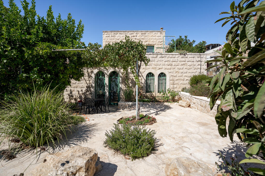
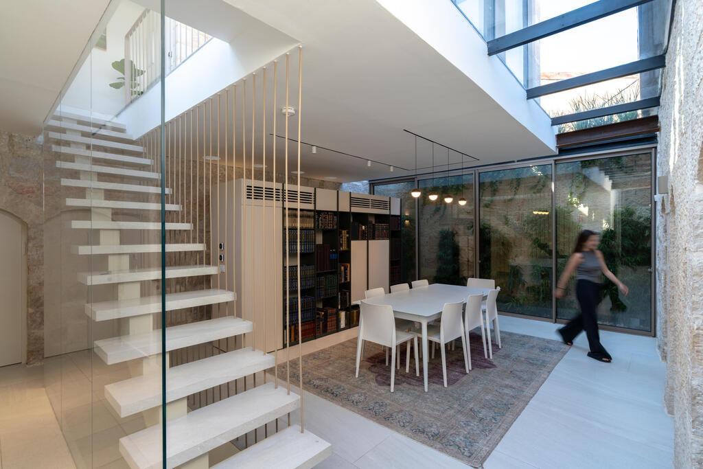
The architect’s house, in a conservation building in the Yemin Moshe neighborhood, demonstrates how a modern intervention in a historic space can produce creative and intimate spaces, which turn the massive stone walls into lightness by matching glass and iron. Strolling between the rooms, through the light staircase and encountering the glass from the sides and above, from the skylight, one is exposed to the sensitivity in planning and the architectural language that the owner of the house dictated, which was intended to emphasize and present the historical dimension, almost without touching it.
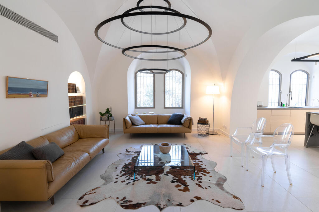
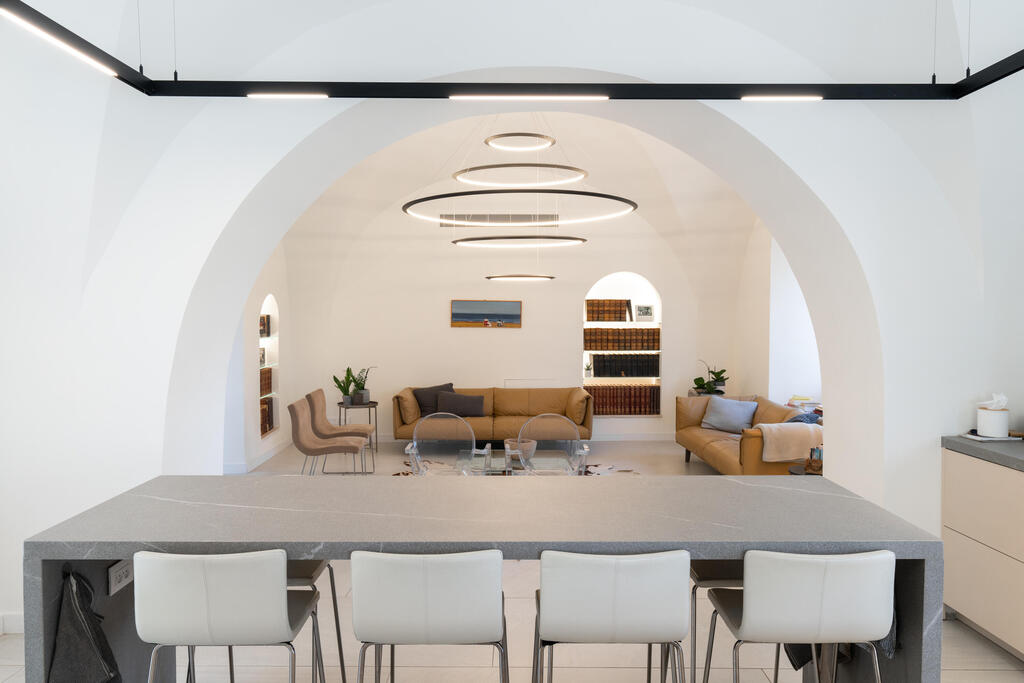
The patio is a courtyard that used to stand between two houses and when they were united into one house, it was converted into an airy hospitality area with natural light penetrating through three levels. “When you intervene and add to an existing historical structure, I believe that it should be clear that this is an addition, to highlight and respect the past,” says Casper about the choice. The move away from the massive stone and the choice of a very modern look, without rustic or eclectic patchwork, compliments the architect’s intention. At certain points in the house, the original stone walls meet the white plaster that dominates the house, from the walls to the vaults, which become a clean substrate that makes way for impressive lighting fixtures, on a scale that is not usually seen in private homes.
The light challenge in the long house
The building: 042 A house within a house, design: Ada Karmi-Melamede Architects
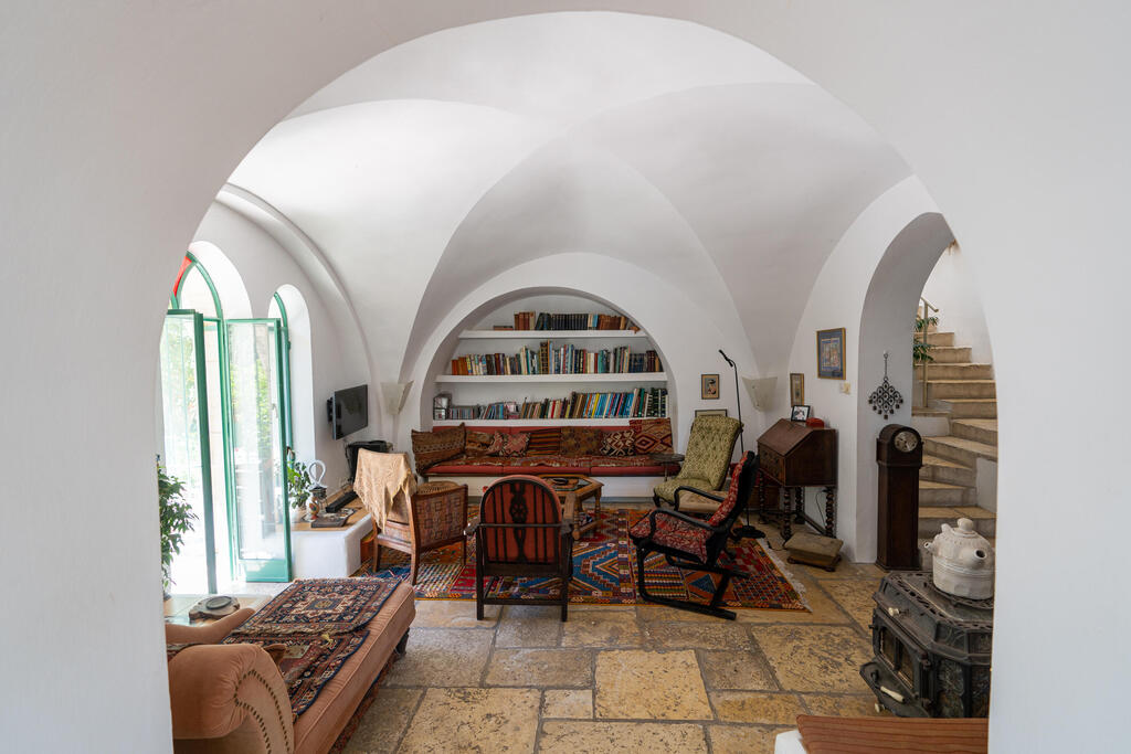
The house in the Yemin Moshe neighborhood was designed with the walls of the old city to the east and west in mind, and the entry of the building to the rock. The historic building, like most of the houses and buildings in the neighborhood, is under strict conservation regulations, which push the planning process several steps forward in finding the exact launch points that will serve the space on all its levels. In this case, the details make all the difference. One example of this is the sculpting of the internal volume that surrounds the openings and creates a distinct opening towards the interior, which does not necessarily follow the arched windows.
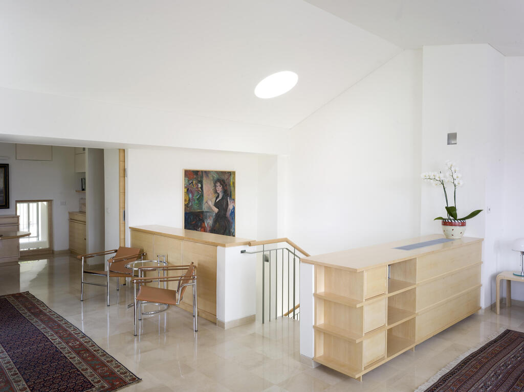
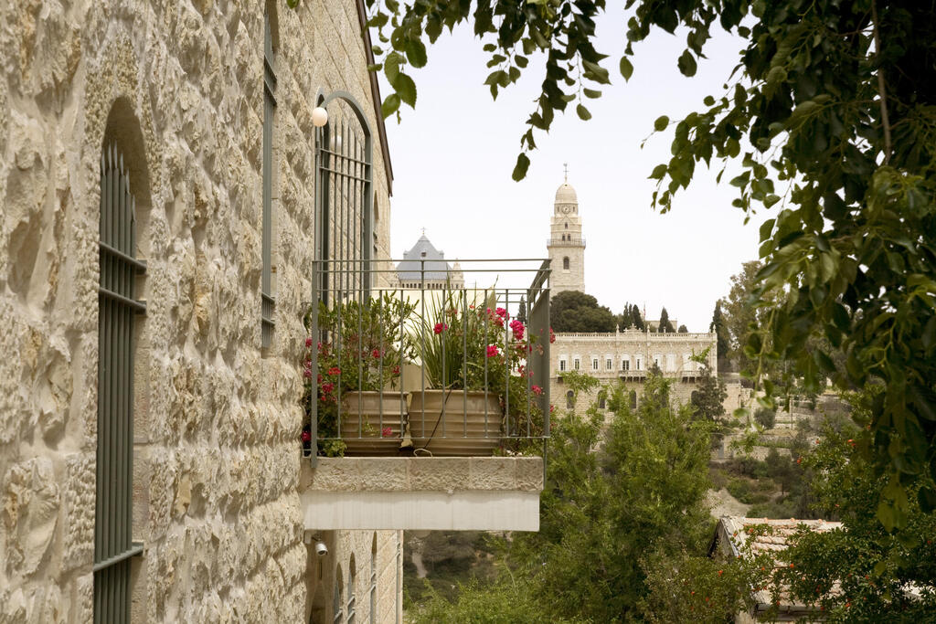
The entrance is located in the center, which was originally designed in the proportions of an elongated rectangle and invited a challenge to deal with the height of the building, with the four levels divided by a trapezoidal staircase, which also functions as a natural light chimney. “The house has four levels: on the entrance floor a foyer, kitchen, dining room and master bedroom; on the floor above is a study and living room; on the floor below are bedrooms and in the basement – a studio and a playroom,” says architect Ada Karmi. “In contrast to the outer, thick and heavy stone walls that carry the weight of the place and history, the feeling inside is light, airy and optimistic.
The freshness comes from the use of light colors that dominate the interior shell of the house, the fixed furniture, the flooring, the stairs and the wooden surfaces in the basement. The introduction of light into the depth of the new internal volume and the movement throughout the height of the house following the light were a main issue in the planning concept. The plan for the different levels was determined from the section since it was through it that the different floors and functions were derived. The internal stairs that travel from floor to floor are designed in wide and soft circular movements, creating eye contact between them, and allowing natural light to penetrate through them. The light reflections that change from floor to floor change the mood of the building and enrich the experience in it.”
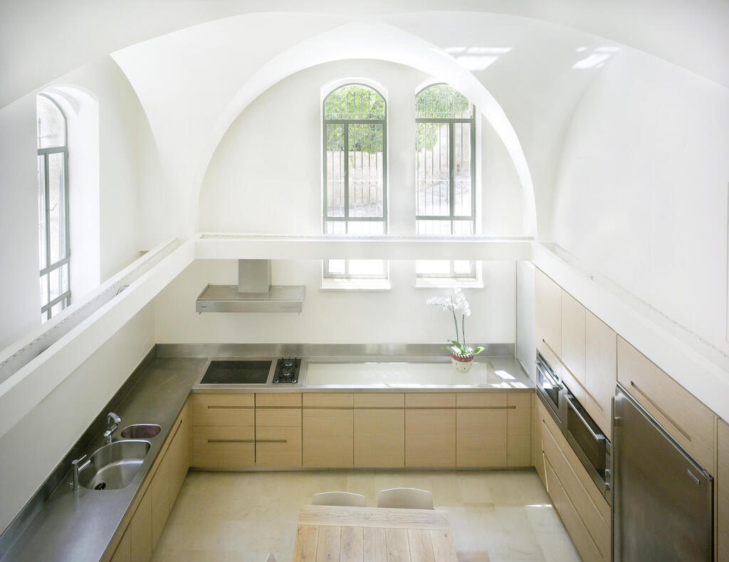
Architect Ofer Arussy, who accompanies the tour of the building, adds: “The treatment of the finishing materials is basic and natural and involves local stone, wood and white plaster, which allows light, like a reflection, to flow in towards the west and into the interior parts of the house and also downwards, into the bedrooms and the studio.”
A multidisciplinary Jerusalem collective operates here
The building: 034 Serafim House (HaMiffal)
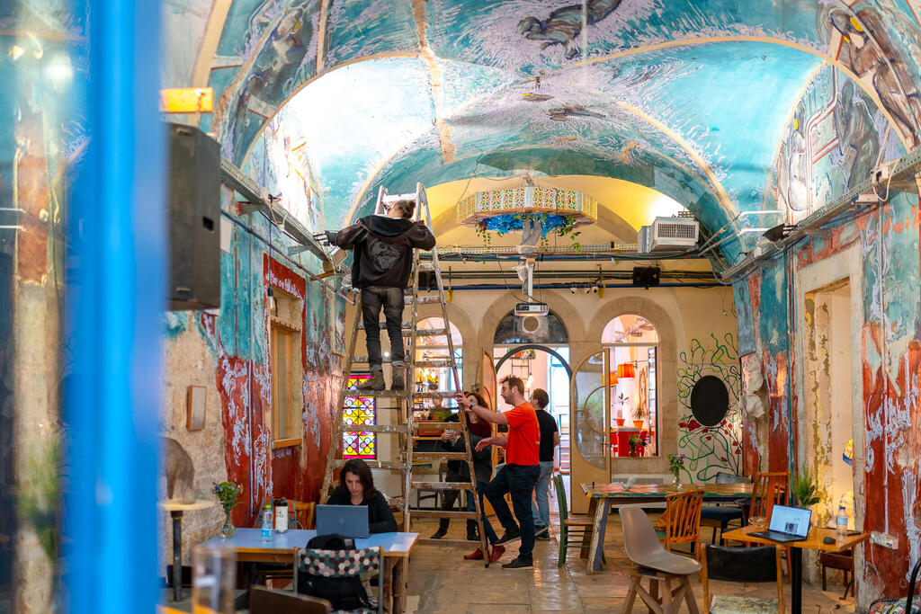
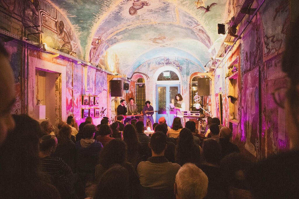
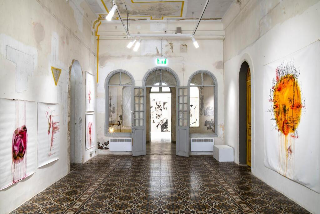
In the Jerusalem cultural sector, “HaMiffal”(Lt. The Factory) is a culture and art center at the heart of which operates the “Bait reik”(Lt. Empty House”) group, which assembled the historical mosaic of the impressive building and continues to operate in it through various channels to this day. Unlike public and cultural buildings whose design and preservation process is planned in detail with a clear result appearing at the end, “HaMiffal” is a living and breathing piece of art that the work on does not stop, and as many people as possible take part in it.
“We looked at the factory as a characteristic of Jerusalem art – preoccupied with collectivity, innovation, multidisciplinary and audience participation,” says Avital Wexler, the chief curator. In every wall and element, the layers of the building and its private history are evident, originally as a large house, then as an abandoned station and later as a special education school that was abandoned again for a decade, until the collective received permission from the municipality to use it. In the various spaces, there are residence programs, galleries, events, a coffee bar, a living room, and more.
A study hall of the new generation
The building: 064 “Mabua”, Studio 1:1 Interior Designers
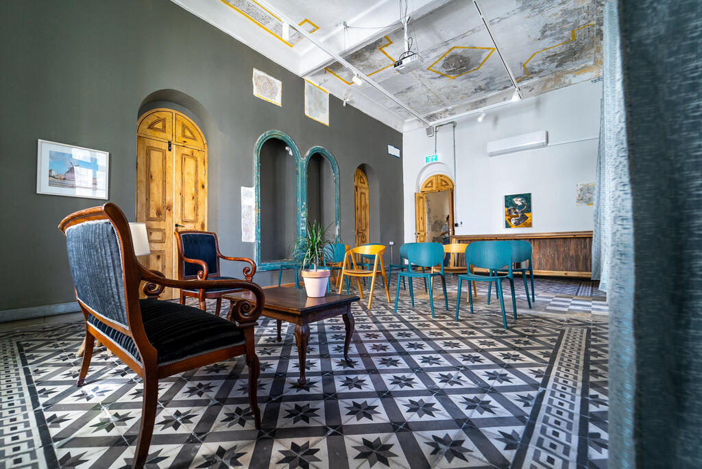
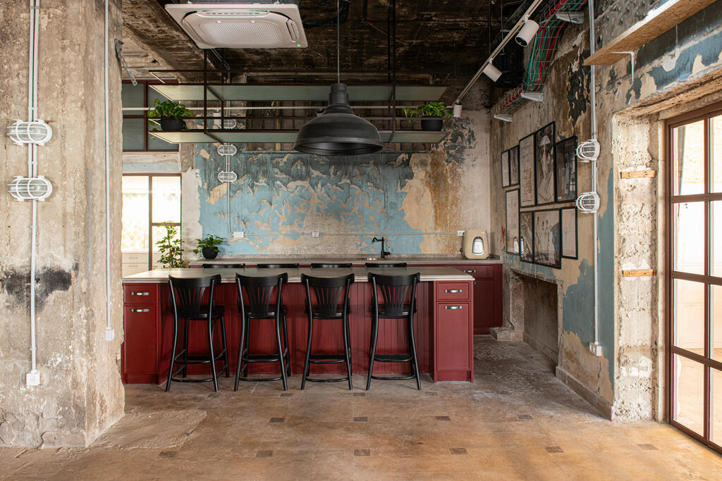
“Mabua” – a new Israeli communal study hall – used for creation, study, prayer and meetings, is located on the pool floor of the mythical President Hotel. The designers approached the work of preservation-reconstruction-design with reverence attributed to the different layers of the building that were revealed at first glance and continued to be revealed as the process progressed.
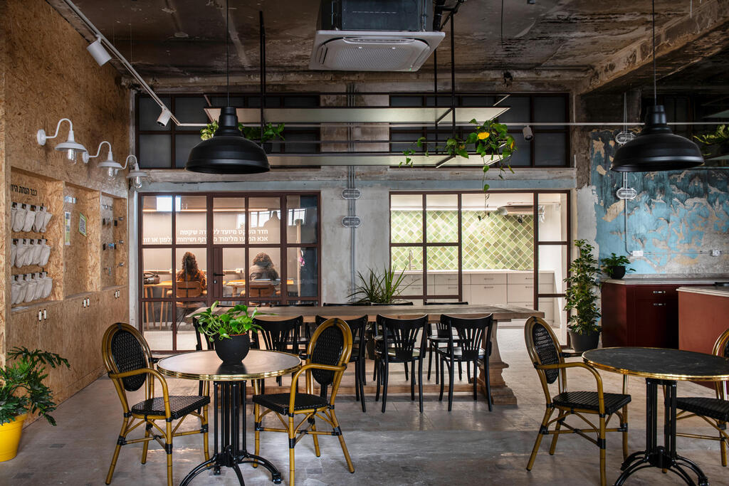
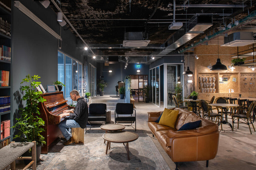
The construction work revealed an impressive graffiti wall that tells of a point in time when the building was abandoned, as well as modern interventions that created an eclectic and inviting space, which sanctifies the community that resides in it and the general public that frequents it. The place is embedded in different corners in a homely atmosphere, including living room spaces, kitchen and dining area, study rooms and offices while integrating the history of the building.
The White House in the green neighborhood
The building: 006 As Beautiful as the Moon, design: Studio One to One Interior Designers
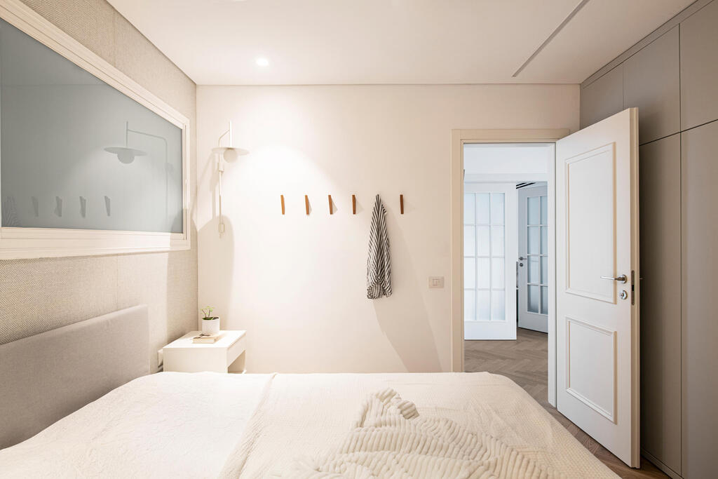
In the four-room apartment in the Jerusalem Garden neighborhood of Beit HaKerem, the designers were asked to design a white and open apartment that would draw as much of the outside into the interior as possible, while remaining clean and functional. The apartment is located on the first floor, and you enter it through a shared courtyard, in a neighborhood characterized by low-rise buildings, gardens, cozy corners and cafes interwoven throughout. The designer duo, Elad Issachar-Aloni and Tali Porat-Strer, maintained a modern, pleasant and natural palette of materials and colors in all the spaces and interwoven the green neighborhood in a design that proves that Jerusalem is not only composed of massive stone and vaults, but also of light elements in a young international language.

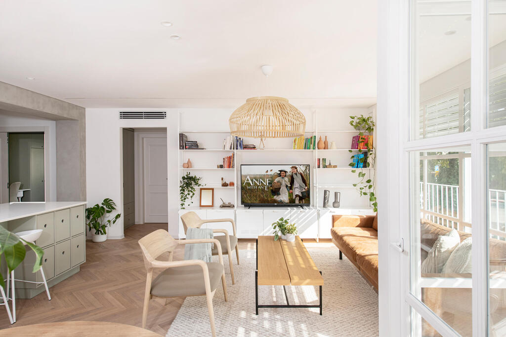
The apartment, which was inherited, was designed for a mother and son and included a redesign of the standard contractor’s apartment, opening up the central space and incorporating eclectic elements for storage and hanging, for some moments the infrastructure also becomes part of the design. In combination with wide openings and a clean glass front with a unique profile – it seems that the interior and the exterior merge.
A glimpse of the old-but-new Ein Kerem
Project: 140 The House on Simtat HaFicus
From a studio building on the lot to a private house measuring 120 square meters. Ceramic artist Naomi Paynton’s house traces the roots of the place through stories and is a testimony to a piece of local history. Architect Judit Green was entrusted with the planning.
Pinto’s works are displayed throughout the house, framed in the house’s shell which combines 200-year-old construction alongside a new design that complements the historic building in its style. In the courtyard that naturally extends from the interior through the generous openings, the millstone that was used as the village’s cloth house is guarded. The house houses Paynton’s studio and this is an opportunity to be exposed to the process of its creation while visiting
