From small spaces to expansive penthouses, the architects and interior designers of these show units share ideas on how to create luxurious yet timeless homes.
Investing in a home that one has not yet physically stepped into is a weighted decision for homeowners. “The interior design of a show unit is important as it helps potential homeowners visualise the possibilities of the space and how a comfortable lifestyle can be realised with good designs,” said Edmund Ng who runs his eponymous architecture firm.
These days, show unit design is not just about embellishing an empty space; it’s also about providing unique and practical ideas on spatial planning related to different demographics and lifestyles. . Post-pandemic, the definition of luxury has also changed, influencing how the show units of high-end properties are designed. Architectural designer and founder of Superfat Designs Lin Weizhang said: “Instead of just expensive materials or shiny surfaces, luxury is now defined by spaces that are calm, where time slows down, where comfort takes over and where you leverage to build on existing relationships.”
We ask four architects and interior designers to share their thoughts as well as ideas on how to create elegant, inviting, and functional homes, using exquisitely designed show units as case studies.
3 Orchard By-The-Park by Superfat Design
Developed by YTL Land and designed by Antonio Citterio, 3 Orchard By-The-Park is one of the most coveted addresses in Singapore’s real estate market. Exclusivity comes in the form of 77 units housed across three 25-storey towers that were envisioned by the Italian architect and designer as “villas in the sky”.
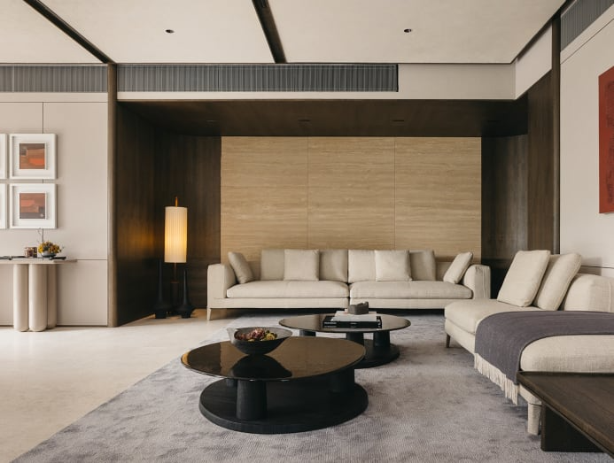
In designing an in-situ, 3,200-sq-ft, four-bedroom duplex show unit for the development, Lin Weizhang attempted to capture the essence of Citterio’s architecture with “a space that resonates with the well-heeled global citizen seeking a residence in Singapore.”
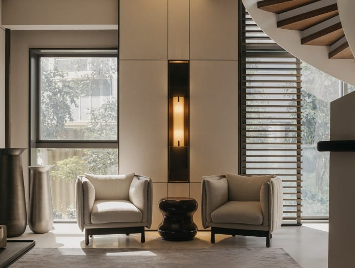
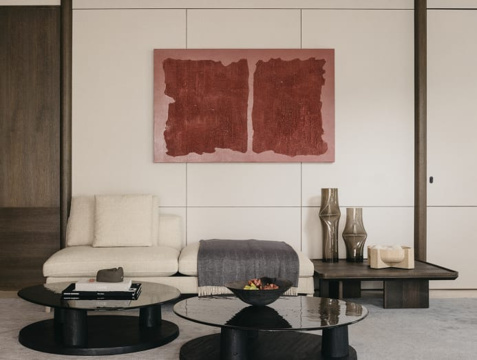
He added: “It reflects a greater awareness of spatial planning, and how that affects the way inhabitants move and use the spaces. We also believe that a space can serve a duality of purposes – to wow and yet comfortable enough to spend an extended amount of time in.”
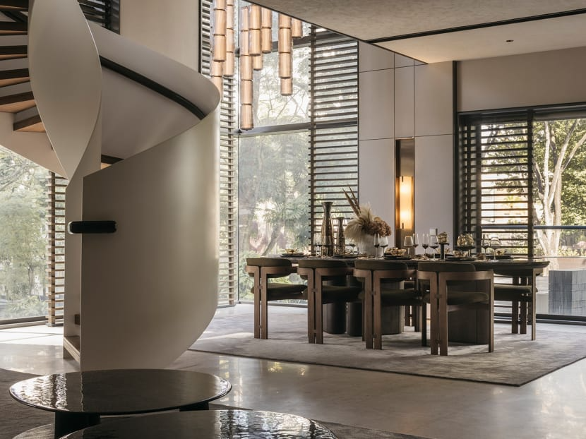
He removed the common dry kitchen for a more capacious living area and framed the lush greenery outside the window with timber screens. “The external landscape and colours also informed the furniture selection and materiality,” Lin highlighted. Citterio’s furniture designs such as his classic Dives modular sofa were chosen to pay homage to the architect’s vision for living.
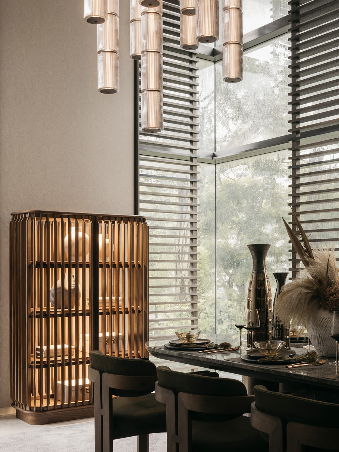
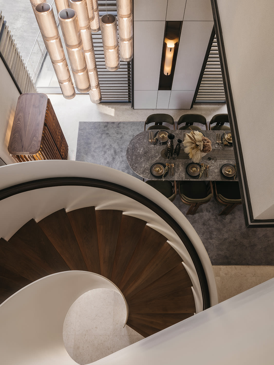
As the dining area is in a double-volume space and visible from Orchard Boulevard, drama is created with a cascading fluted pendent. It draws focus to the lofty space as one exits via the private lift into the dining area. Commissioned textured artwork in a series of landscaped abstracts mirror the lush greenery.
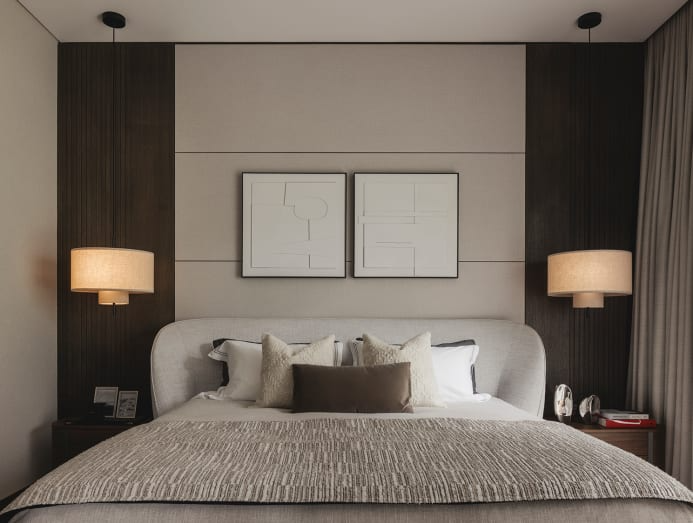
Lin advises homeowners to let their lifestyle dictate the home’s style and not the other way around. “A home has to reflect you, the inhabitant,” he said. Another advice is to use screens as layers to create depth and perspective like in this show unit. They draw one’s eye to the spaces outside the unit while providing privacy for the occupants. Together with muted colours and textures, this creates “visual interest in a quiet, understated way”.