From uplifting blues to deep rich reds, these shades are the ones to watch in 2025
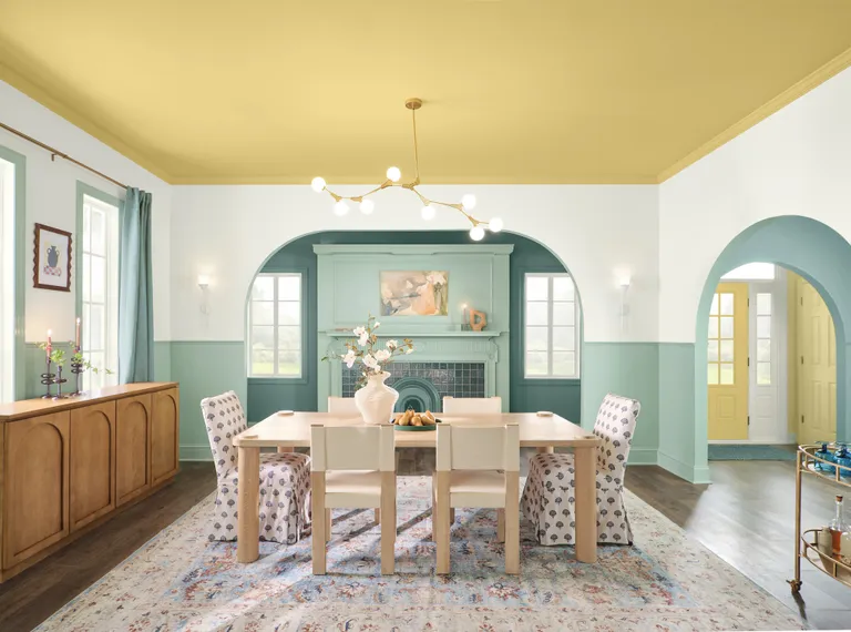
Color forecasting season is officially upon us, and we’re spoilt for choice with this year’s predicted trends. With the start of September comes a flood of Color of the Year announcements from our favorite paint brands, and 2025 is shaping up to be one of the most varied lineups of all.
If you’re a fan of decorating with color, it can be hard to know where to look. Of course, there tend to be some recurring themes across the board (last year it was blues that swept the table), but there are often some more left-field predictions that turn heads. Inevitably, they all play a huge role in influencing our decorating habits over the next 12 months and beyond, so you’ll want to have your finger firmly on the pulse if you’re a keen designer.
A wash of color of the year announcements have been made in recent weeks, with more to follow throughout the month. From uplifting blue hues to deep rich reds, these color trends all speak to the mod of the moment in their unique ways, and there really is something for everyone in the lineup so far. If, like us, you like to stay ahead of the curve, these are the shades that should definitely be on your radar.
What is Pantone’s color of the year?
One of the most anticipated color announcements every year comes from Pantone. The industry leader has a huge influence over color trends, and its unique insight into our everyday uses of color through its matching system means the brand is well-placed to predict the direction of our color preferences and decor habits.
You’ll still need to wait a little longer to find out what Pantone’s color of the year for 2025 is, however. The brand is an outlier from others, releasing its announcement in early December (a decision that allows them to scout out paint brand’s predictions to inform their decision, we expect!). Pantone’s color of the year 2024, Peach Fuzz, felt appropriately warm and dreamy for the year just gone, but what will the brand have in store for 2025? Only time will tell, but we’ll be sure to keep you in the loop as news develops.
1. Behr – Rumors
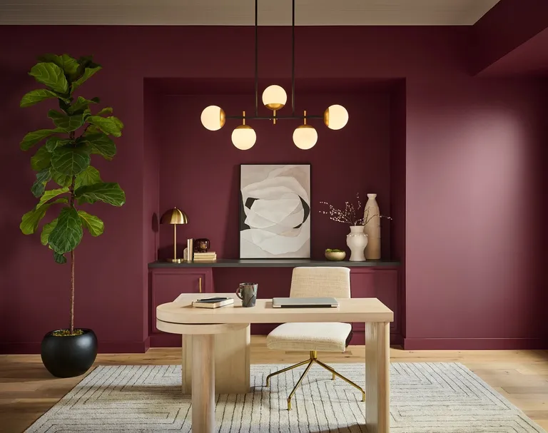
Behr is always ahead of the game when it comes to color trends. Historically, the brand has trodden its own path when it comes to color of the year announcements with shades that have veered from the more common themes. This year, however, Behr’s color of the year 2025 cements deep reds as a popular choice among painting pros, and we’re certainly happy about it.
Rumors is a deep and dynamic eggplant purple that oozes comfort and feels seriously sophisticated on walls. We’re sure this regal shade will be a popular pick for decorating with jewel tones, and it looks especially elegant when used for color drenching. In a year that’s been dominated by bold, head-turning colors (like the “unexpected red” trend) an equally eye-catching and saturated shade like this one feels so natural for 2025.
“We’re seeing people embrace color like never before,” explains Erika Woelfel, Vice President of Color and Creative Services at Behr Paint Company. “Rumors is a modern take on the timeless red that creates an energetic appeal to make a lasting statement in a stunning way.”
2. Valspar – Encore
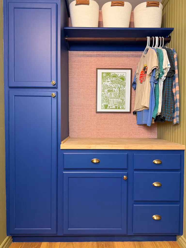
Speaking of bold color, saturated color, Valspar’s color of the year for 2025 embodies just that. Announced last month, Encore 8002-45G is a punchy primary blue that’s deep, inviting, and energetic.
This choice is hardly surprising considering the current decorating climate. Blues have dominated our paint ideas this past 12 months (Vaslpar even named Renew Blue their color of the year for 2024) and with trends like bold trim proving so popular lately, pops of surprising, saturated color are on everyone’s radar.
Despite its boldness, it’s easier to integrate this shade into your home than you might think. “Encore is a color for any space or application,” says Sue Kim, director of color marketing at Valspar. “It’s an ideal backdrop to ground a room, leaving space for spirited pops of complementary colors.”
3. Dutch Boy – Mapped Blue
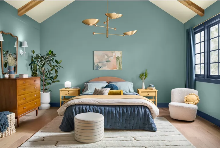
Promoting wellness was key to Dutch Boy’s color plans for the year ahead. Following on from this year’s key trends, they recently announced Mapped Blue – a calming and serene mid blue – as their color of the year for 2025. Subtle yellow undertones give this shade a dependable foundation and an uplifting feel meaning this versatile shade works virtually anywhere in the home.
“Our 2025 Color of the Year, Mapped Blue, is more than just a trend: it’s a reflection of changing consumer values,” stated Lisbeth Parada, Color Marketing Manager for Dutch Boy Paints. “We’re seeing a significant shift, particularly among Millennials and Gen Zs, toward products that offer durability, functionality and timeless aesthetics. Mapped Blue answers this call, providing a classic yet modern charm that can adapt to various design styles and stand the test of time.” This is sure to become a light blue paint color that designers love.
4. HGTV Home by Sherwin-Williams – Quietude
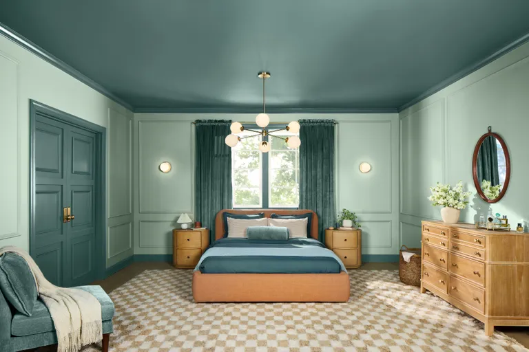
Blues and greens have dominated recent trends, and Quietude by HGTV Home by Sherwin-Williams combines them both. Defined as “a soft sage with a whisper of blue influence” by Ashley Banbury, Color Marketing Manager at HGTV Home by Sherwin-Williams, it’s a light and airy color that we’re sure to be seeing a lot more of next year.
“A lot of individuals are wanting to slow down and have a space in their home where they can disengage from social media or work, and relax their mind,” says Ashley. “I think there’s also a shift happening that leans more towards those watery blues and greens, rather than gray neutrals.”
The best light blue paints mimic natural elements like ocean waves, and the bright yet subdued hue of Quietude embodies that serenity. Try it in a bedroom or a bathroom for a truly relaxing feel.
5. Minwax – Violet
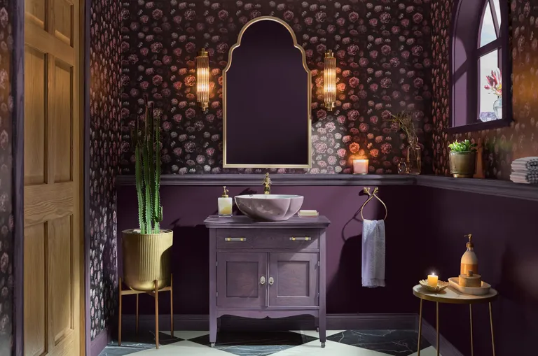
Minwax is the leading brand of wood stains and its color of the year for 2025 signals a bold new era of home design where self-expression takes center stage. As the name suggests, Violet is a true purple that feels regal and elegant and makes it easy to decorate with color on any surface. Inspired by cultural movements like cafécore and the rise of book communities, it infuses spaces with an old-timey feel that’s cozy and sophisticated.
“Deeper, more saturated colors can serve as compelling alternatives to timeless shades,” explains Lisbeth Parada, Minwax’s Color & Design Lead. “Violet, when paired with natural wood tones, creates a striking contrast that feels both classic and contemporary. From subtle color accents to bold statements with color drenching, this versatile shade offers homeowners countless ways to infuse depth and character into any space.”
6. C2 – Raku
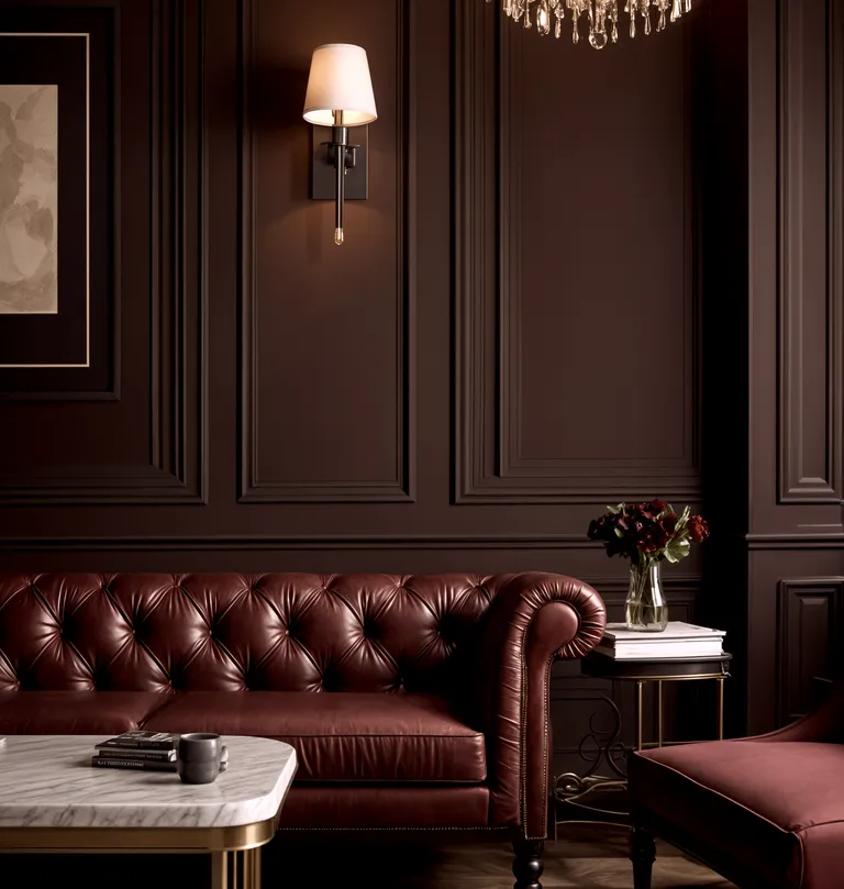
If you prefer a more earthy, neutral tone, C2’s color of the year is a rich mahogany that’s versatile and grounding. By definition, Raku is a brownish red, but C2’s Paint Color and Design Specialist says it has a “chameleon-like quality”, meaning it picks up the tones of the surrounding colors and materials depending on your room’s lighting. This makes it easy to create a color palette around the shade, opening opportunities for so many versatile uses around the home.
“C2 Raku encourages you to create balance but in a sophisticated way, and create spaces where you can unwind from the fast pace of life and technology, pause, take a breath, and reflect,” says Philippa Radon at C2. “Rooted in the concept of Yin and Yang, Raku harmonizes tradition with contemporary style. It becomes the connection between the emotional and the experiential, providing a way to embrace balance and enjoy life’s more meaningful moments – the ones that nurture our souls in order to meet our days with strength and positivity.”