Why we’re looking to the 70s and finding joy in secondhand this autumn/winter.

For autumn/winter 2024, homes become more confident and joyful, with strong retro references, and a playful and youthful colour palette.
As we close the year, the 70s revival will only become more prevalent as we tap into the fun and optimism of the era. We are also embracing the joy of decorating with vintage and secondhand pieces, while finding fulfilment in rolling up our sleeves and tackling DIY home projects.
Below, 10 design experts weigh in on what they believe will be the top interior design trends for autumn and beyond.
Vintage and secondhand
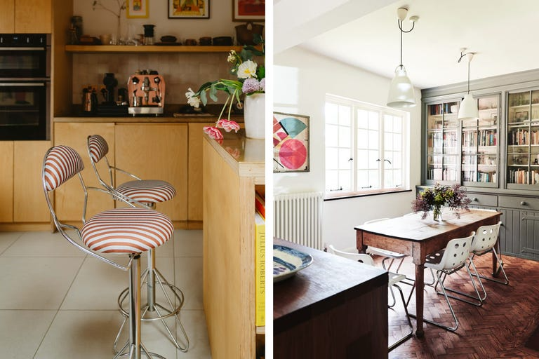
The long-overdue migration of vintage and antique sellers online has made shopping secondhand easier than ever. There is a charm too in older items, in the patterns or colours or silhouettes that make them stand out from high street furniture and homeware.
‘People really appreciate how storied items can bring warmth, history, and soul to their homes,’ says interior designer Naomi Astley Clarke. ‘Recently, my work has emphasised embracing reclaimed finishes and secondhand furniture. Increasingly, my clients want to make sure their homes are as environmentally friendly as possible and are prioritising swapping new furniture for quality antiques at a similar price point.’
Harriet Pringle, founder of Narchie, a treasure trove of vintage and antique furniture and homeware, champions buying secondhand and vintage as the most sustainable way to shop for your home. ‘It gives new life to something that would otherwise be chucked away,’ she says. ‘Recycling homeware can be complicated, as many items are constructed with a mixture of materials, which makes them difficult, and sometimes even impossible to recycle. By reusing homeware we are reducing numbers ending up in landfill. Plus it means that there are fewer polluting resources being used to manufacture new items.’
The concealed kitchen
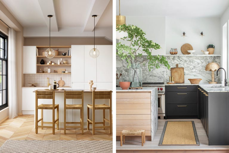
Clever storage solutions will never lose favour, but they are increasingly geared towards hiding bulky appliances that detract from the aesthetic value of a kitchen.
‘All those everyday life savers like coffee machines, air fryers, magic bullets – we need them, and we use them often but we just don’t want to see them out on our beautiful kitchen space. So it’s all about tucking away and concealing that day to day functionality,’ says Melissa Klink, creative director at Harvey Jones.
Pantries and larders with floor-to-ceiling shelves are today as likely to hold dry food and vegetables as they are microwaves and toasters.
‘We are seeing homeowners create elements of surprise, concealing appliances while creating stylish coffee stations and minibars perfect for entertaining,’ says Nicolle Whyte, design director at Olive & Barr. ‘Open shelving still has its place but for more decorative items such as art and ornaments rather than kitchen crockery.’
Great big sofas (and great big armchairs)
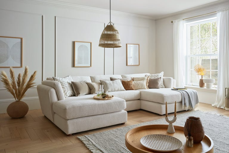
Our love affair with sleek and spindly mid-century sofas is dwindling, and big, squishy sofas are in. Enormous U-shapes, wraparound corner sofas, and an endless number of add-on modules encourage you to sit, lounge, lie down, cuddle up and welcome as many guests as you like.
‘We’re noticing a shift in sofa sizes. While 3-seaters are on the decline, there’s a rising demand for 3.5 and 4-seater options. It seems customers are gravitating towards more spacious seating arrangements that still offer style and comfort,’ says Lena Gierasinska, head of product and display at Barker and Stonehouse. ‘Modules can be rearranged to create various layouts, from sprawling sectionals to cosy spots. They offer design versatility, allowing for playful arrangements and serving as smart long-term investments for those expecting changing needs.’
The partner of the great big sofa is the great big accent chair, sized somewhere between an armchair and a loveseat. It is an enticing spot to sit and enveloping in its form – cushions are usually oversized and extra plump – and is often designed as a bold accent in an eye-catching colour or print.
‘An accent chair allows you to make a statement with your furniture and completely change up the feel of the room,’ says Victoria Foster, an interior stylist at ScS. ‘In recent years we’ve seen a clear shift away from matching suites towards mismatched furniture, thoughtfully chosen together.’
The 70s Revival

The laidback styling, natural materials, and earthy tones of 70s interior design have found new life in recent years. ’70s interior design is making a big comeback. This decor style is relaxed and fun, evocative of the free-spiritedness and optimism of the 70s era,’ says Matilda Martin, trend specialist at Lick.
‘Use a combination of vibrant slogans, 70s prints and contemporary graphics to add character to a room and make it your own,’ says Vicki Walker, product manager and trends expert at Hillarys. ‘Confident, free flowing shapes like curves and abstract designs will take priority in homeware patterns, with velvet being a key material. This trend is all about bringing yourself joy, being unapologetic in your design decisions and decorating to your own taste.’
In terms of colour profile, the 70s trend is rich and earthy. ‘Warmth emanates from a 70s-inspired home, largely through its colour scheme. People are adding that 70s groove and energy into their homes by incorporating earthy browns, terracotta reds and oranges (think Lick’s Red 03 or Orange 02 on your walls) and opting for low lighting in the form of the iconic mushroom lamp,’ Matilda adds.
Buttery yellows
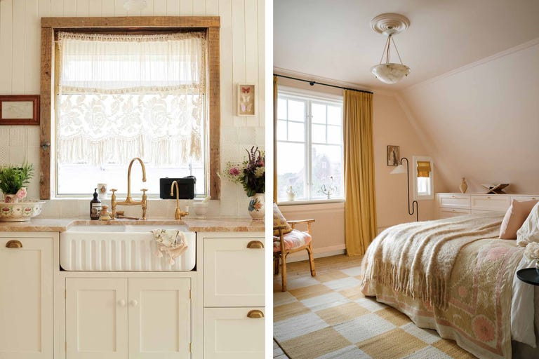
Nourishing yellows have become increasingly popular in the home – wheat field neutrals have supplanted bright whites on our walls, and our love affair with mustard endures.
In 2024 we found a happy middle ground in butter yellow. Michael Rolland, managing director at The Paint Shed calls it ‘a buttery magnolia shade which is inviting and warm, welcoming people into your space’.
Butter yellow is used in a clever monochromatic way – a single shade across walls, floors and furniture to create a room that looks as if it is permanently bathed in sunlight.
Shelley Cochrane, accessories buyer at Furniture Village, calls these hues ‘rich yet subtle, as they gently introduce pops of colour and infuse your home with the energising warmth of nature’s colour palette. Pair a base of sandy neutrals with rich russet tones, fresh pops of blush pink and nourishing shades of forest green to create a warm and welcoming scheme’.
Quiet luxury
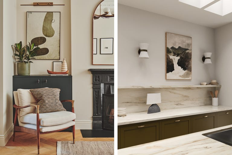
Quiet luxury had all the markers of a short-lived TikTok trend, but its insistence on quality, craftsmanship and an understated elegance have found a natural and enduring home in interiors.
‘Originating in the world of fashion, we’re hearing quiet luxury mentioned more and more in interiors,’ says Melissa. ‘Within the home, we translate this term to focus on the quality of materials selected and allowing them to dominate the style of the room, the blend of unique finishes creates spaces that are immediately elegant and softer as a result of the layered combinations. Nothing garish.’
Quiet luxury is the opposite of the exuberant maximalism that fills a room with colour, pattern and lots and lots of things. It is not quite minimalism either – things are not the enemy, but they are chosen with consideration, care and moderation, and over time.
DIY wall panelling
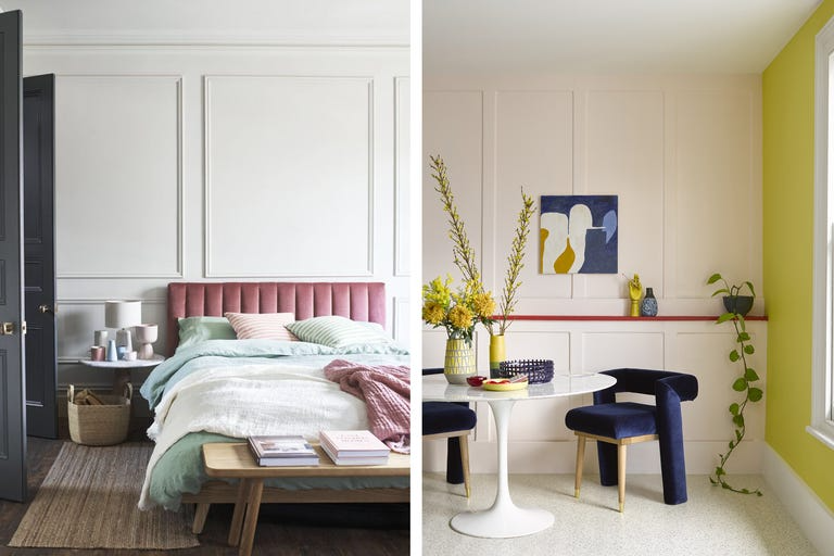
The epic DIY makeovers of social media’s most popular renovators (read about our favourite home renovation accounts) have instilled a belief that we too can tile our own floors and paint our own kitchen cabinets.
The slightly more forgiving task of wall panelling has emerged as the go-to DIY project (read our simple guide to DIY wall panelling) and social media has become a hub of inspiration – try searching the hashtags #wallpanelling and #wallpanellingideas to see what other people have been up to.
‘The DIY project has gained loads of traction online as over 23.8 million TikTok users see how much difference the addition of wall panelling can have on a room,’ say the interior experts at Stelrad. ‘By adding wooden panels to a feature wall before adding a lick of paint, the high end appearance adds an instant touch of luxury, helping you to achieve a premium feel on a budget. Many people choose to add panelling in the bedroom behind the headboard, creating a focal point that can suit a variety of aesthetics and add new textures to a plain surface.’