This year it’s all about embracing style moments with personality and flair, from out-there canopy hoods and effortless arches to fabulous fluted stone
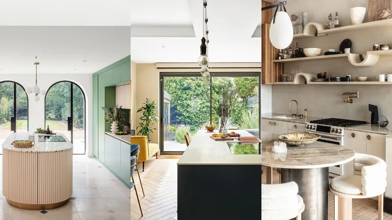
Establishing which kitchen style float your boat, and which sink like a stone, is all part and parcel of learning how to plan a kitchen remodel. Arguably the best place to start is with the latest kitchen trends – use them to narrow down your options and work out which kitchen ideas you are drawn to.
For 2024, there’s a distinct feel of sophistication in the air. Forget Barbiecore, maximalism and color clashes, this year’s kitchen trends are all about warm neutral palettes, considered material connections and clever tricks to refine the layout. While there are many smaller interior design trends going on, the overriding theme is definitely toward a more luxe aesthetic.
‘Kitchen trends are evolving into a more luxurious direction this year, as more designers and architects explore innovative ways to use materials and textures, and promote high levels of artistry and craftsmanship in our cooking spaces. It’s an exciting time to be working on kitchen projects,’ agrees Texas-based interior designer, Ginger Curtis.
The biggest kitchen trends of 2024
For kitchen trends with star appeal, and plenty to get guests talking, we’ve spoken to some of the best kitchen experts and designers in the business to bring you the very latest looks. So whether you’re seeking small kitchen trends for a cozy space, or for some wow moments to make open plan kitchen ideas sing, keep reading.
1. Take kitchen tiles to the ceiling
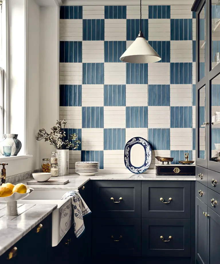
It seems kitchen tile ideas get more adventurous every season and the new trend for taking tiles right up to the kitchen ceiling is pitched at those who love a strong punch of color and pattern.
It seems kitchen tile ideas get more adventurous every season and the new trend for taking tiles right up to the kitchen ceiling is pitched at those who love a strong punch of color and pattern.
2. Break up blocks of color with checkered pattern
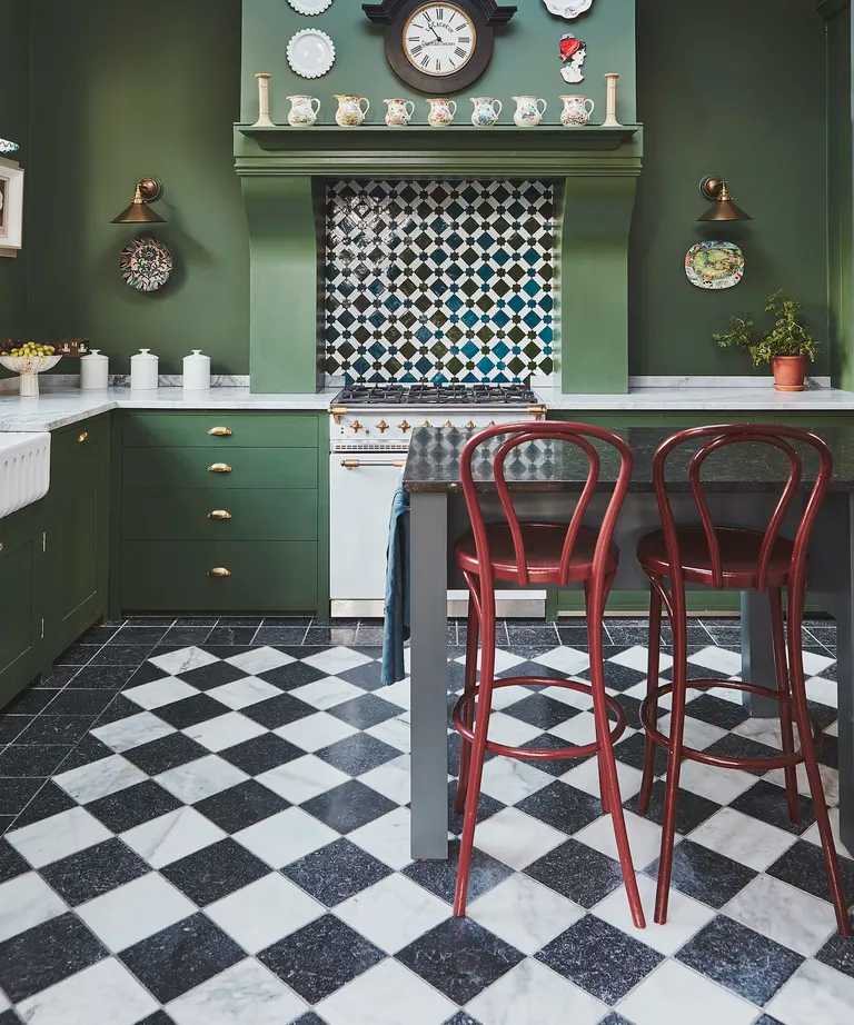
Decorating with checks never gets old, and on kitchen flooring the trend for checkerboard tiling is making a comeback for 2024. Gaining serious traction in both modern kitchen ideas and more classical interiors, this easy-on-the-eye option is a versatile look underfoot.
In this kitchen, Jennifer Hamilton, director of Vawdrey House, used two types of tumbled marble to give a lived-in, nostalgic feel. ‘The monochrome pallet is classic and elegant and the tumbled stone softens the contrasts, ensuring it doesn’t appear too stark,’ she says.
To give this style revival a fresh look, follow Jennifer’s lead and add a border tile. ‘This creates a rug effect that brings an extra layer of interest and can also prove very handy for visually absorbing any walls that aren’t perfectly symmetrical; a common issue in period homes,’ she adds.
3. Double up on islands
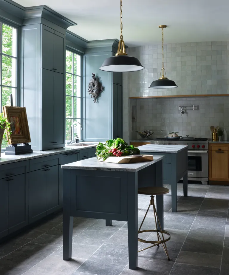
One kitchen island is so last year, we’re seeing double in 2024 and plenty of interior designers are already extolling the benefits of twin islands. In all but the biggest kitchens, the advantages are often about improving the traffic flow rather than doubling your prep space. One long island can obstruct the quickest routes into and around your kitchen, splitting it into two solves everything.
In this kitchen, Bradley Odom opted for two islands for two very good reasons. ‘Aesthetically, the room is much longer than it is wide so we didn’t want to have such an expansive island that would stop your eye visually,’ he explains. ‘Functionally, a professional chef lives in the space and wanted the flexibility and convenience of being able to move nimbly throughout the spaces.’
A double island design is also beneficial for shared cooking, allowing two or more to work together, without getting under each other’s feet. You could also designate specific roles for each island. One for cooking, the other for eating and socialising.
4. The open-plan back kitchen
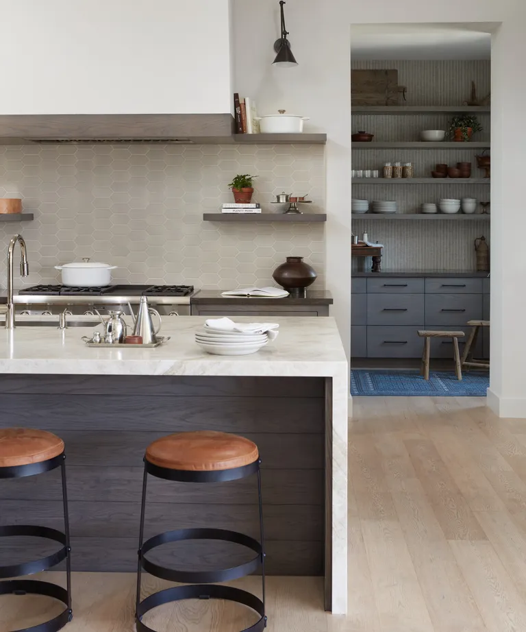
Forget hidden pantries that are out of sight, out of mind, open-plan back kitchens are hardworking spaces that are so beautifully appointed they deserve to be seen. If you’ve ever wondered what is a back kitchen, Kristine Renee of Design Alchemy has the skinny.
‘A.K.A. working kitchens, these are the ultimate hideaway for housing small appliances, secondary refrigeration, and keeping the main kitchen clean and tidy. These spaces are highly functional and are our clients’ go-to spot for stashing dirty dishes when entertaining, freeing up the main entertaining spaces. Prep and storage clutter up the back kitchens, leaving their main kitchens spotless,’ explains Kristine.
But while Kristine agrees there should be a tucked away area for all this untidiness to take place, she’s also embracing the virtues of an open-access ‘front of shop’, which is decorated to impress, and we’re right with her.
‘We love to dress an open-access back kitchen creatively, having fun with the wallpaper, tile, and cabinetry to create a ‘jewel box’ space that tells its own narrative,’ says Kristine. At the entrance to your back kitchen, she recommends setting up a stylish coffee bar, cocktail bar, or breakfast station that’s easily accessible and creates an enticing vignette from the kitchen.
5. Outsized canopy hoods
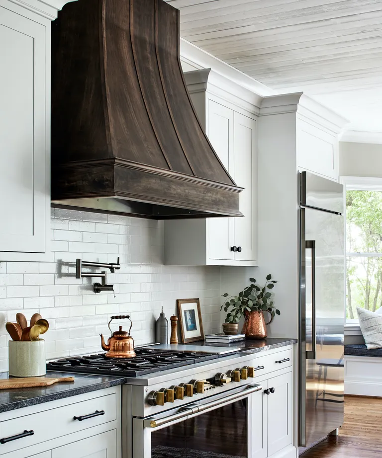
There are two clear routes to take when venting your kitchen, completely invisible extraction or a cooker hood that’s literally unmissable. And if you’re the kind of person who can’t miss the opportunity to bring more texture, shape and interest into your kitchen, you’ll be all over the latter.
One of the strongest design leads we’re seeing in the exhibitionist extractor club is the outsized canopy hood. Styled on the classic fireplace canopy, this bold shape is big news. ‘We love a traditional chimney-shape hood that soars right up to the ceiling,’ enthuses Tanya Smith-Shiflett, founder of Unique Kitchens & Baths. ‘It’s a great way to enhance the sense of height in your kitchen, provides extra design drama and will secure the cooking area as your kitchen’s firm focal point.’
6. Countertop cabinets
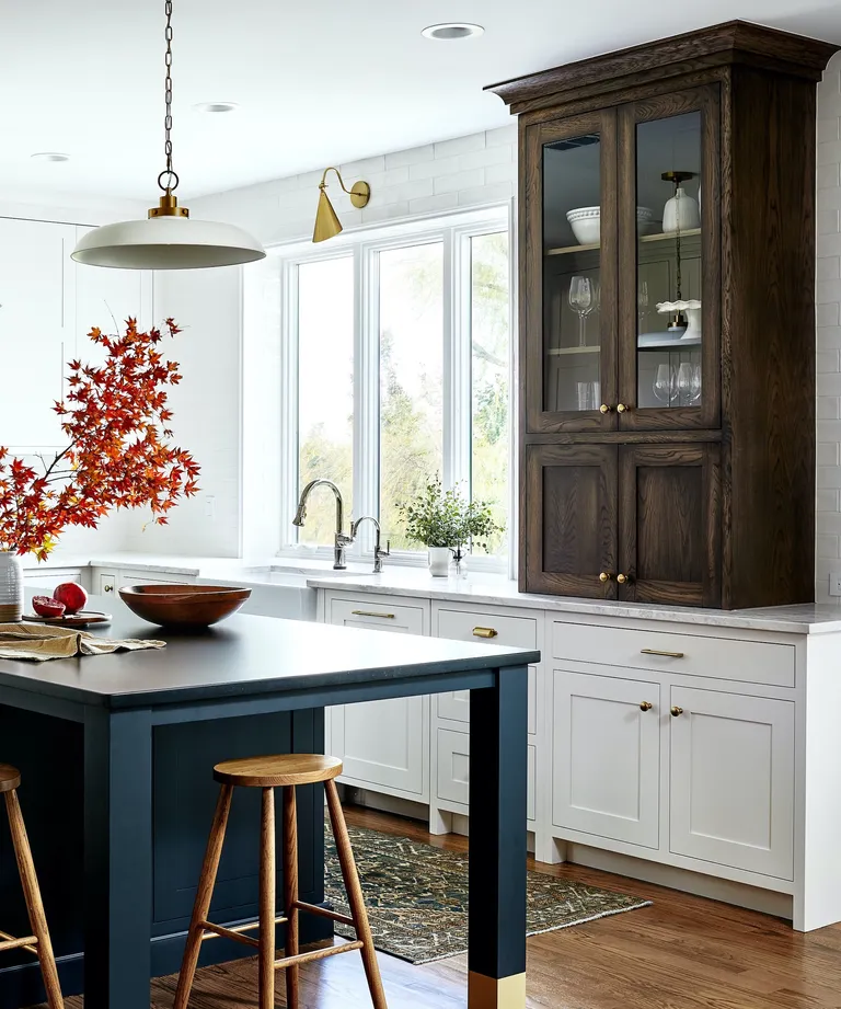
Filling that awkward void between base cabinets and uppers with style, the countertop cabinet is a future design staple that’s set to change the fitted kitchen install as we know it.
Generally the same depth as upper kitchen cabinets (i.e. narrower than base units), but taller, these sit-on units lend a freeform dresser-style look when made from contrasting materials to the rest of the kitchen cabinets. This gorgeous example by Unique Kitchens & Baths demonstrates exactly why the countertop cabinet is catching on. ‘Using stained oak on the countertop cabinet gives it a more furniture-like feel, while introducing warmth to the scheme and visual interest,’ says founder Tanya Smith-Shiflett.
Some iterations feature bi-fold doors that stack back to reveal small appliances, others are more about storing glassware and decorative collections. Tucked in the corner, countertop cabinets can also prove far more practical than empty, dead space.
7. Follow the curve
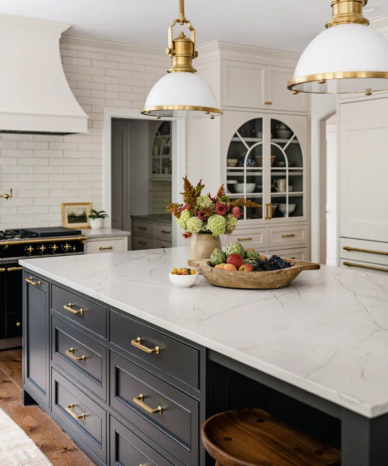
Arches, pill shapes, lozenges…whatever you want to call them, these tall curves are shaking up kitchen design, bringing a softer aesthetic in their wake. As the modern way to break up lots of blocky cabinets, it only takes one or two arched moments to break free from the rigidity of fitted cabinetry.
‘An arched cabinet is a great way to create a focal point, adding a classical element to an otherwise new kitchen, or bathroom,’ says Emily Ruff of Cohesively Curated Interiors. ‘The popularity of arches is a trend that follows the revival of arched doorways, which we’re seeing more and more. This home had arched doorways throughout, so we added an arch on the kitchen cabinets to tie everything together.’
8. Show-stopping lighting
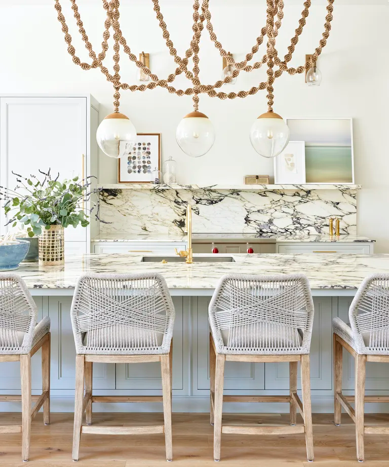
Looking for ways to take your kitchen to the next level? Get onboard the trend for high-impact lighting, the bigger the better. High-statement light fixtures are increasingly popular in modern, open plan kitchens because they’re just such an easy win on the impressiveness front. ‘In this open concept home we weren’t afraid to go big with the lighting because we knew it would be enjoyed from every view,’ recalls interior designer Elizabeth Krueger. ‘We kept the uppers simple and minimal in the kitchen and went for it with the light.’
It’s not just scale that will make sure your kitchen lighting is a conversation starter, the best kitchen lighting ideas also bring texture, shape and color to the party – sometimes all at once!
9. Fluted meets marble
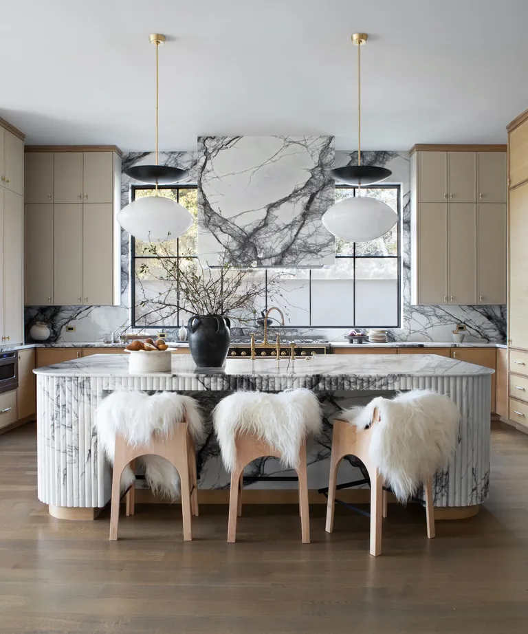
Just when we thought the fluting trend had reached its peak, along came fluted stone and we’re drooling over this undulating surface trend all over again. ‘The fluted stone trend, particularly in the form of exquisitely carved marble, represents a timeless yet modern design choice that seamlessly blends texture, elegance, and luxury,’ says Ginger Curtis, founder of Urbanology Designs, who conceived this exceptional kitchen in University Park, Texas.
This design element is more than just an aesthetic statement; it’s a testament to craftsmanship and the beauty of natural materials, according to Ginger. ‘As a designer I am always seeking to add depth and character into a space and fluted marble emerges as a favorite for its ability to offer a tactile and visually engaging experience,’ she explains. ‘The lines and shadows cast by fluted surfaces play with light in unique ways, bringing a dynamic and sophisticated element to kitchen interiors.’
10. Blend rustic and luxurious
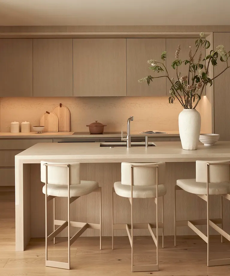
Forget rustic wood, the newest way to embrace timber in the kitchen is sophisticated; think cashmere colors and tone-on-tone elegance. Sabra Ballon of Ballon Studio has her finger on the natural luxe pulse, explaining that the secret to success lies in a restrained material palette featuring natural textures and warm neutrals.
‘For this project, I wanted to create an interior that was soft, in a ‘California Modernism’ way, using natural materials like leather, oak, limestone and washed textiles, on top of which, we layered the furnishings,’ says Sabra.
‘The white oak, floor-to-ceiling cabinetry hides everything. The stone on the island drapes over the sides, giving the impression of a tablecloth – a very durable one. The pale palette and symmetry of the kitchen is understated yet powerful. The quiet hues, such as the upholstery on the stools at the island and the nearby custom banquette, add to the calm atmosphere we were aiming for.’ Who needs rustic when you can make timber look this stylish and serene?