The smart but welcoming rooms in this LA home remind us of our favorite Nancy Meyers movies. Take a look round
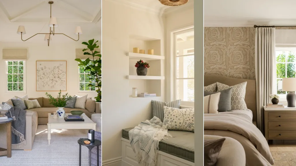
We’re obsessing over this Los Angeles house. There’s something very familiar about it. It’s smart, yet relaxed, traditional but still on trend and, above all, it’s the kind of place we’d feel welcome and make ourselves at home. And then we realized – it’s giving us those Nancy Meyers vibes. It’s like all our favorite movie sets blended into the one house design.
The family room has all the California chic of Cameron Diaz’s LA house in The Holiday, and it’s not hard to picture Erica Barry, the lead character in Something’s Gotta Give, in the beautiful kitchen here. While the bathroom and bedrooms have that elevated and comfortable look that’s become a key part of the Nancy Meyers aesthetic. No wonder we want to live here.
There’s much more to this home’s style than its movie star appeal, however, and there are plenty of fresh interior design ideas in the mix. Designer Denise Morrison of Morrison Interiors worked with the owners on the property’s renovation, creating a home that beautifully combines traditional elements with lasting style. She shares her highlights below.
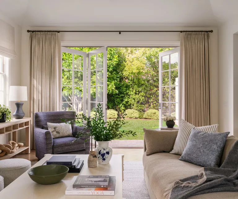
‘The original interiors of the home had a lot of modern elements in the lighting, wallpaper and paint selections,’ says designer Denise Morrison. ‘While the exterior had a more traditional look which our client loved. We focused on aligning the interior with the exterior, bringing in more traditional elements through the design.’
Denise’s living room ideas for the family room showcase the abundant natural light, the instant connection with the outside space, typical of many Californian homes. ‘
‘We wanted this space to feel inviting and love the way it flows to the exterior’ says Denise, who selected the calm neutrals for the furnishings along with drapes in soft natural linen (a classic Nancy Meyers textile choice, incidentally).
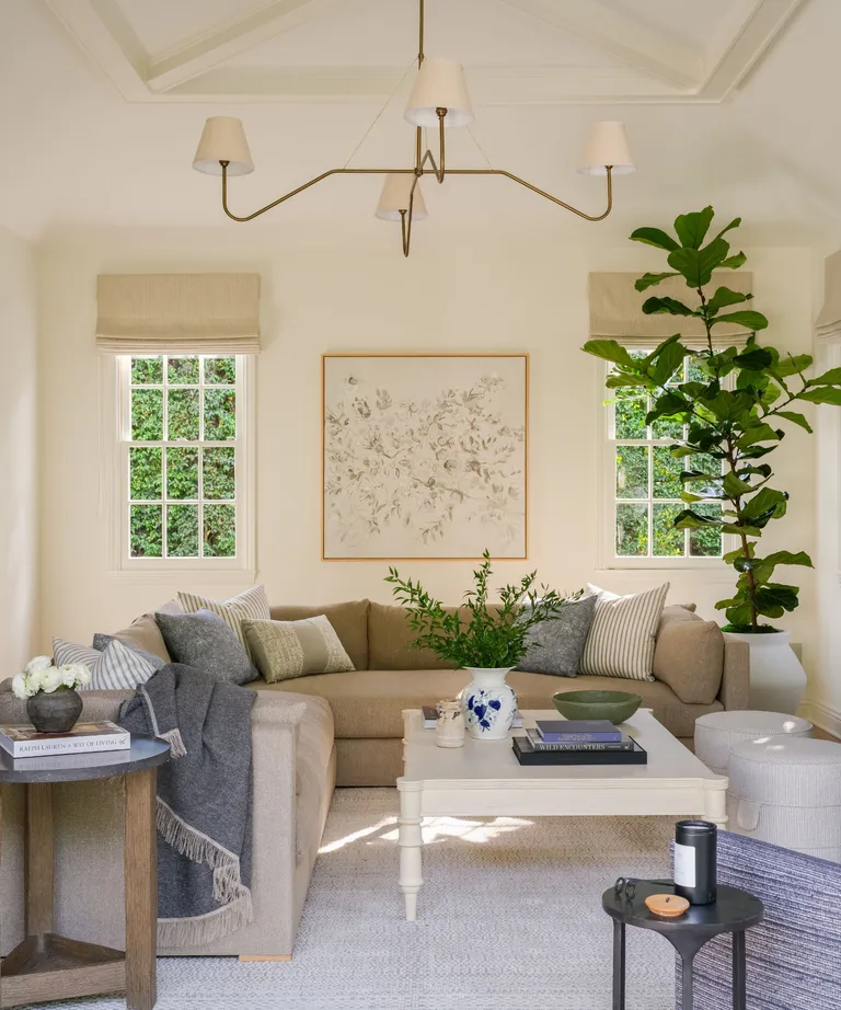
Opting for sectional seating for the living room, there’s always the danger that the room design becomes linear or hard-edged. However, by layering the couch with pillows and throws (very Meyers), and by including the two round stools in the scheme, Denise creates a softer overall look that’s very inviting.
We love the high vaulted ceiling in this room, the gentle quality of the light, and the huge house plant that’s not far off reaching that ceiling. Add in fresh flowers and a strong coffee table styling game, for a look that’s elevated, timeless and also very livable.
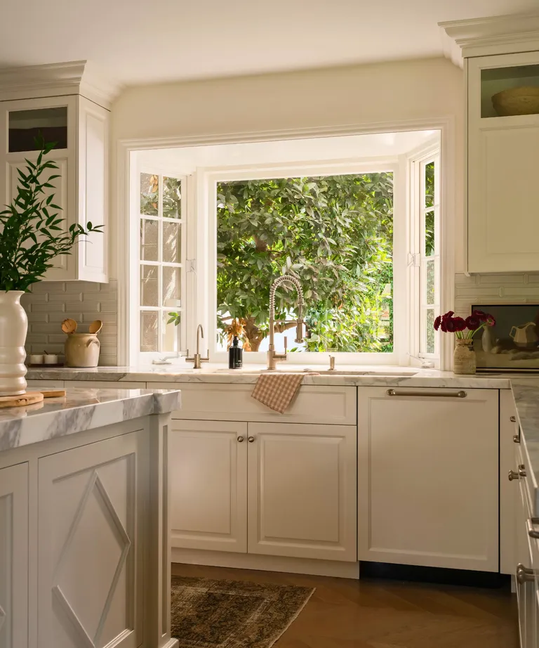
Although many parts of the home required major redesigns to create the timeless traditional style the owners were looking for, the kitchen ideas were all about painting the kitchen cabinetry to give the room a refresh. The designer specified new tiles and the new painted finish for the cabinets, and focused on bringing in accessories to add warmth and charm to the space.
Part-glazed cream cabinets, subway tiles, elegant detailing on the moldings, and the light coming in through that beautiful bay window over the sink.
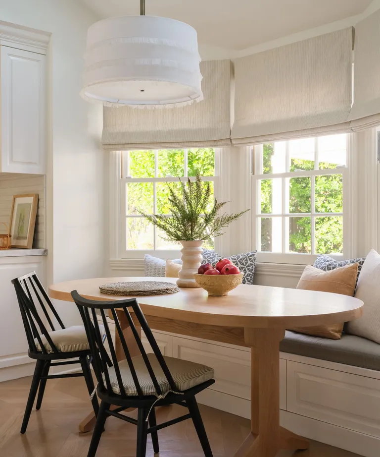
The kitchen footprint is compact, but Denise and the homeowners wanted to find space for a dining nook. The statement pendant light from Bone Simple defines this special set-up, while the Tazi oval table from House of Morrison is the perfect space-saving solution and ideal partner for the built-in banquette window seat.
Oh, and is my memory playing tricks or wasn’t there a very similar oval kitchen table and black chair arrangement in It’s Complicated?
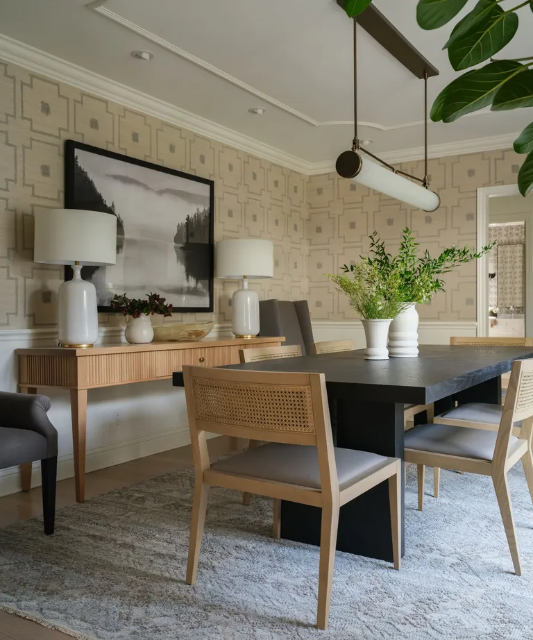
Although some of the dining room ideas here made us think of the elevated dining room in Amanda’s (played by Cameron Diaz) LA home in The Holiday, that movie’s now nearly 18 years old. Like the movie, our tastes in interior styles have come of age since then and designer Denise has given this classic scheme more lasting appeal with well-chosen furniture and décor.
The combination of dark and light wood furniture is particularly effective accessorized with the area rug, and white ceramic lamps and vases. The wallcovering is McLaurin & Piercy’s Shinto design.
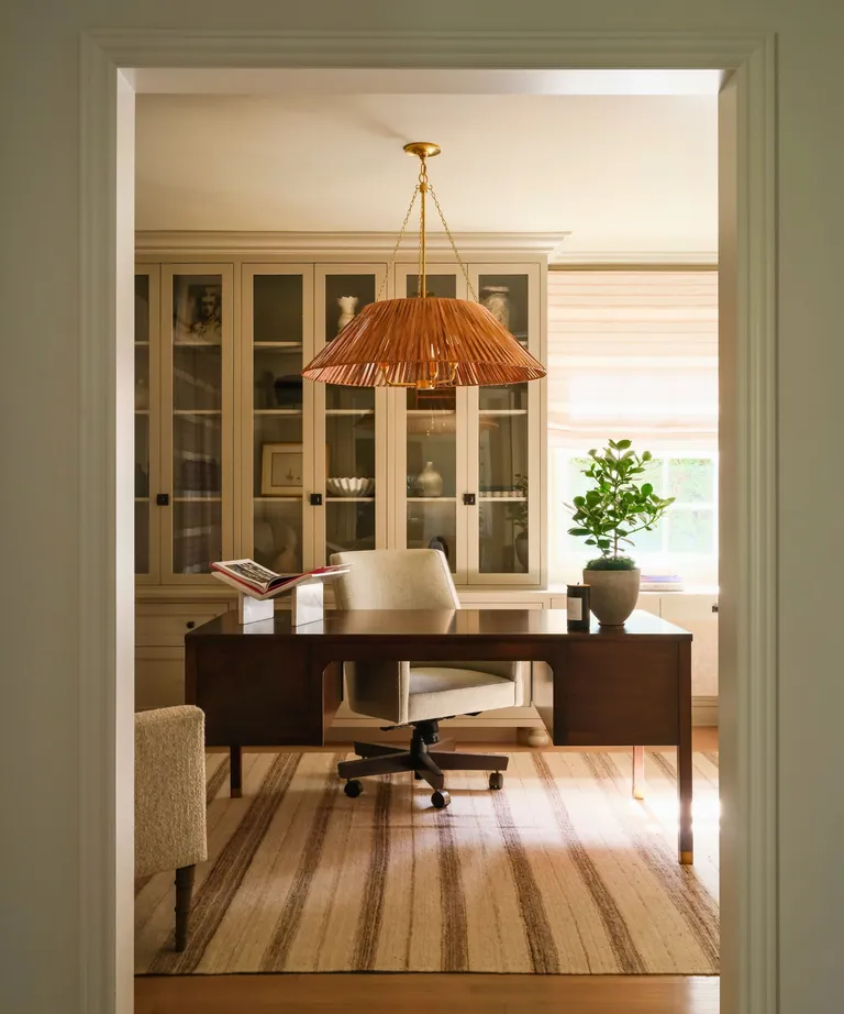
Home office ideas in this home are in keeping with the thoughtful design of the rest of the home, Classic, well made furniture is balanced by statement pieces that pull the scheme together. Here, it’s a pendant light by Visual Comfort and a Kilim stripe rug by Marc Phillips that are the room’s hero elements. Custom built-ins provide display and storage to keep things tidy in the working from home space.

Home office ideas in this home are in keeping with the thoughtful design of the rest of the home, Classic, well made furniture is balanced by statement pieces that pull the scheme together. Here, it’s a pendant light by Visual Comfort and a Kilim stripe rug by Marc Phillips that are the room’s hero elements. Custom built-ins provide display and storage to keep things tidy in the working from home space.
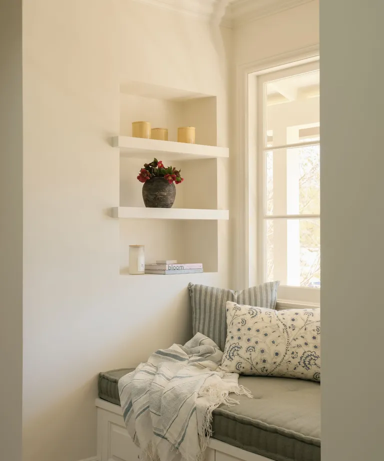
By all means read your work documents in the dedicated home office but this cute reading nook is all about reading for pleasure. At the top of the stairs with a view off the front of the house, it’s an indulgent space with pillows and throws to make it irresistible.
‘Tucked away from the hustle and bustle of the public areas of the home, it’s the perfect retreat to relax and unwind,’ says designer Denise. ‘The large window offered not only a view, but lots of natural sunshine to further create a relaxing ambiance.’
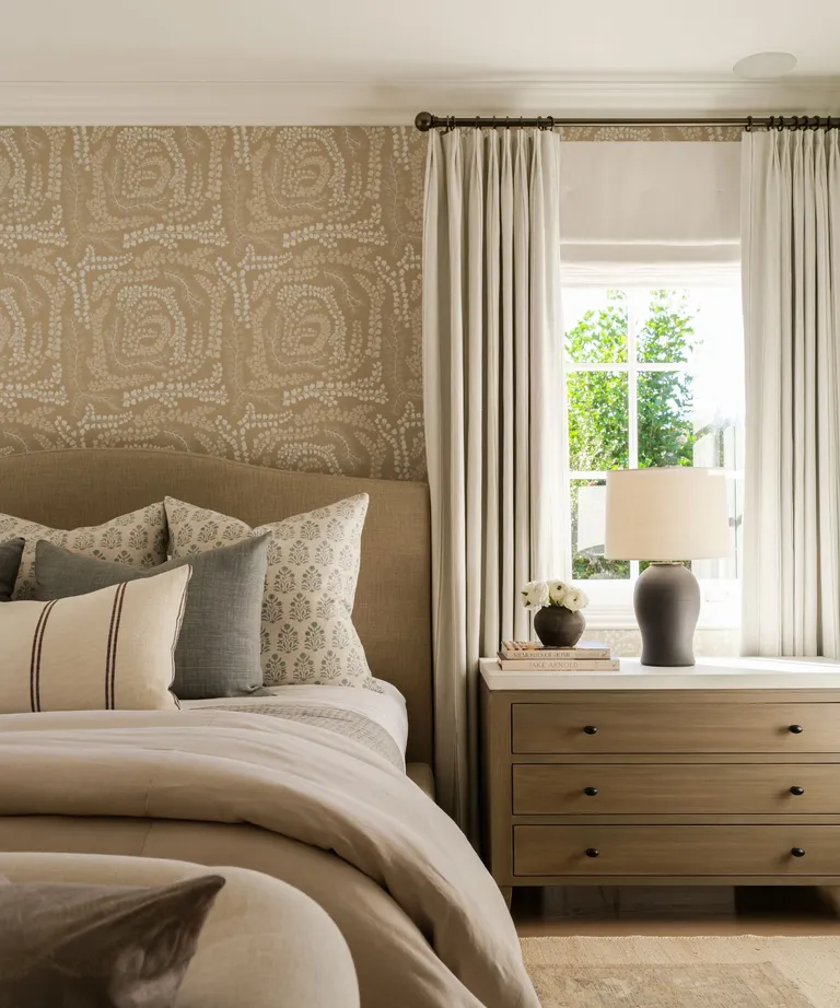
Looking for bedroom ideas for a smart, timeless scheme? This delightful symphony of taupes and warm neutrals is inspired. The wallcovering is by Harlequin, providing a subtle pattern in amongst the neutral textiles. Denise chose a custom bed from House of Morrison and the neat Byron nightstand by Robert James Collection.
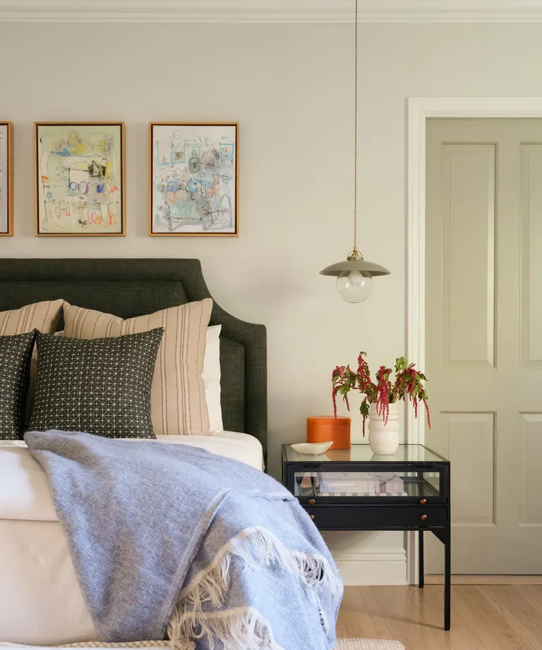
The designer’s choices for the guest bedroom tick all the boxes. Neutral color choices, but not shying away from the strong statement bedhead, and with an attractive low pendant light in place of a bedside lamp, the room has everything an overnight guest could need.
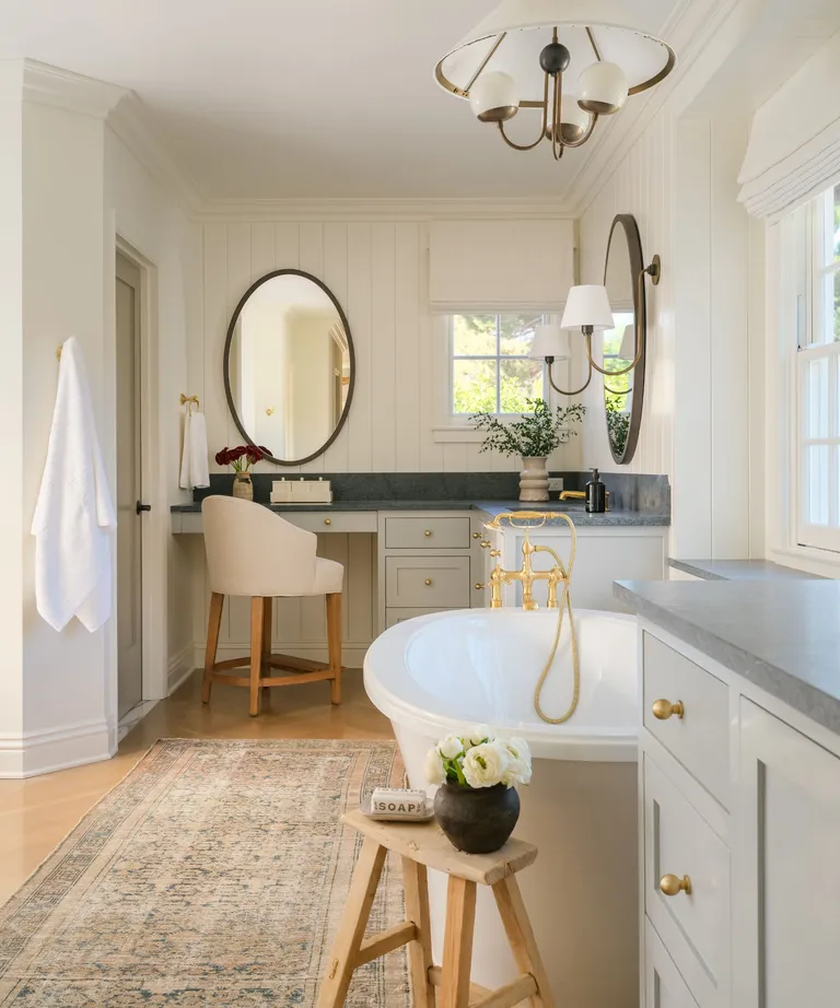
It’s easy to imagine any of Nancy Meyers’ lead characters relaxing in this paneled bathroom, and that image of Cameron Diaz squeezed into the tiny cottage bathtub is one of the many charming comedy moments in The Holiday. She’d have no such problem in this generously proportioned room – the roll-top bath is a good size and there’s plenty of space for pampering too.
Denise and the team at Morrison Interiors completely updated this bathroom, introducing the tongue and groove paneling, serene colors, new tub and brass hardware.