One of the greatest joys of building a home from the ground up is the opportunity it affords to make it completely yours. You aren’t confined to any existing structure, or to the trends or architecture popular in that specific place and time. You can do whatever you please.
That was exactly the case for the owners of this modern home, tucked away in a quiet corner of Dallas, Texas. Knocking down a small ranch-style house, the couple — one the owner of a jewelery shop and the other an engineer — enlisted local design firm Maestri Studio to help them create a new home that encapsulated the architectural styles and design features they saw while living and traveling through Asia.
Instantly welcoming and with a deliberate eastern motif throughout, the home still feels completely at ease in its North American setting, with subtle hints of mid-century and laidback SoCal style.
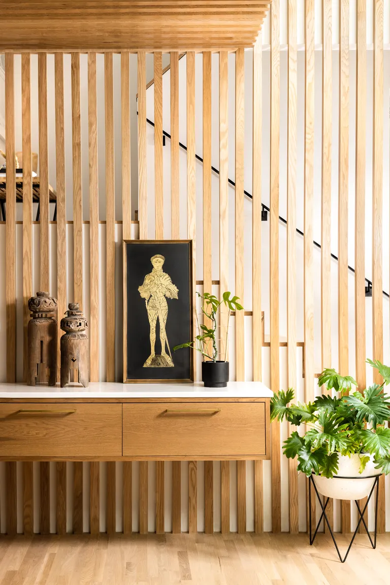
We all know how important entryways are to a home’s design story, as they set the scene and provide a glimpse of what is to come. From the moment you step through the door of this home and into the entry hallway, the striking use of slatted timber becomes wonderfully apparent.
‘The wood feature is reminiscent of Japanese rain screens,’ explains Eddie Maestri, ADA and founder/creative director of Maestri Studio. ‘It was incorporated to bring texture and warmth into the home.’
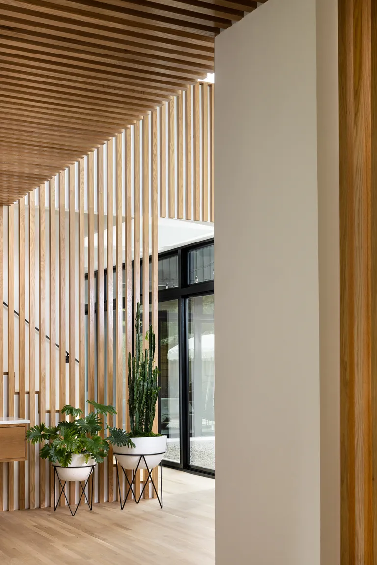
The recurring detail, which pops against the crisp white interior wall color, acts as a divider between rooms and cleverly cocoons the staircase without blocking access to natural light.
The wood slats run upright along the walls and even across the ceiling in some places, drawing your eyeline up and accentuating the vastness of the double-void.
Timber is abundant. Its on the floors, the walls, and in the furniture choices, yet the home doesn’t feel weighed down or dark. This is in part thanks to the free flow of light through the slatted design, as well as the warm, honey-tones of the oak.
The kitchen
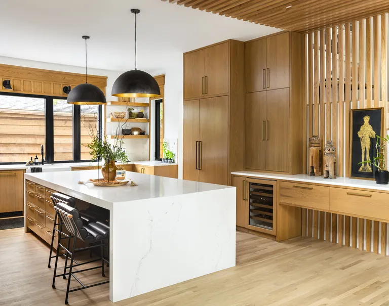
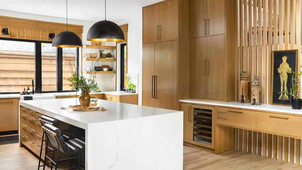
A floating timber console in the entry hallway continues through to the kitchen, fusing mid-century aesthetics with a nod to Asian design, and cleverly connecting the two spaces. But this room is about far more than just good looks.
‘We wanted the kitchen to be functional, sophisticated and to have an abundance of storage,’ explains Eddie. ‘The large center island has a lot of function built-in, while large windows over the sink allow for plenty of light and make the space feel more open.’
There is a bar fridge, open shelving and integrated appliances, all of which give the kitchen big ticks in terms of modern design credentials, while the timber joinery keeps it consistent with the aesthetic of the rest of the home.
The Butler’s Pantry
The Bathroom
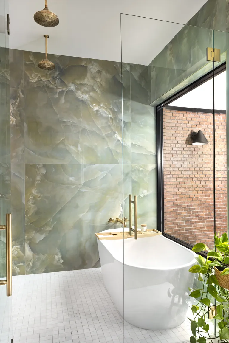
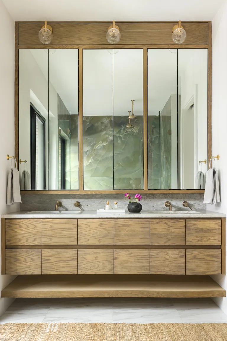
The primary bathroom is instantly relaxing and feels like stepping into a spa thanks to the floor-to-ceiling wall of a Jade-inspired tile from Ann Sacks. The swirling gold veins of the stone have been perfectly complemented with modern brass tap fittings, double shower heads, door handles and hinges — a perfect moment of East meets West.
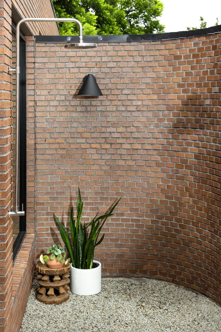
The freestanding bathtub has been framed by a large window and soaks up views onto the zen-style garden just outside, with its gravel courtyard and outdoor shower.
The space feels spacious and light, and although it boasts plenty of statements, the soft gray floor tiles help to balance it, adding softness and space to breath.
The Garden
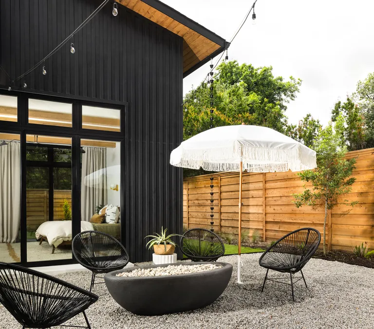
Outside, the palette becomes much darker, with a black exterior reminiscent of the traditional Japanese technique of charring timber, known as Shou Sugi Ban.
As is typical in a lot of Japanese garden design, natural elements such as stone, timber, greenery and water come to the forefront. The gravel, the fire pit that looks like it has been carved from stone, the outdoor shower and even the choice of plants, all contribute to the feel.
It’s peaceful and welcoming, much like the rest of the house, which, thanks to its considered approach by Maestri Studio, manages to blend hints of mid-century and SoCal design with Asian influences in perfect harmony.
