One couple’s search for their first home led them to a quirky neighborhood in California, where they fell for a double-wide in a tight-knit community of mobile homes.
Home Sweet Mobile Home
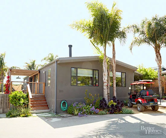
A California couple was looking to upgrade from their one-bedroom apartment when the husband stumbled upon a neighborhood of mobile homes after a day of surfing; they were soon smitten. They decided to invest in a 1970s double-wide and quickly went to work gutting and transforming it with the help of designer Frances Merrill of Reath Design.
Living Large
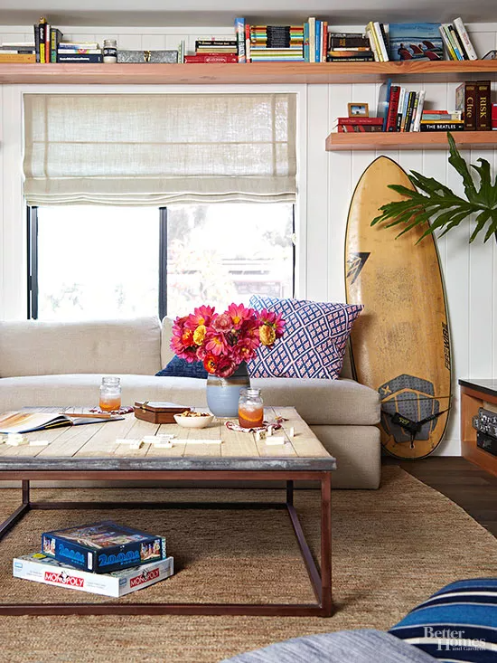
Their first feat was to create an open floor plan and a strong indoor-outdoor connection that would make the two-bedroom, two-bath home feel as large as possible. Merrill designed the sectional with two cushions the size of twin mattresses, so the homeowners could slip on fitted sheets to transform the living room into a second guest room. Open shelves circle the living room and continue into the kitchen, creating much needed storage without taking up precious floor space.
Go with the Flow
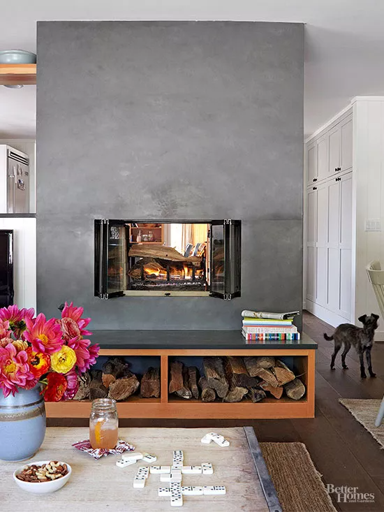
Cladding the dated fireplace in slate gave it a much-deserved facelift. It delineates the living and dining areas from the kitchen and warms both spaces. Consistent materials—wood, slate, and natural textiles—make the house feel unified and create easy flow.
Warm Welcome
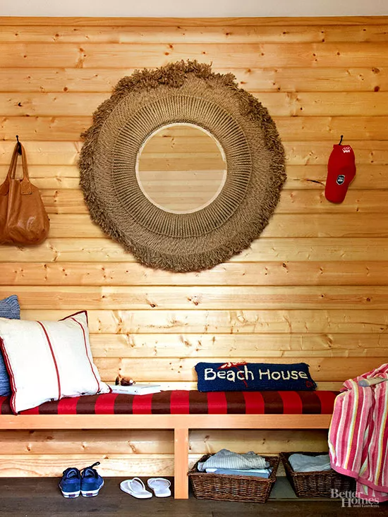
A built-in bench turns the entry into a mudroom where guests can kick off their shoes after a walk on the beach.
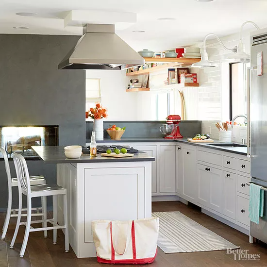
The same slate that was used on the double-sided fireplace was used again on the countertops in the kitchen. White cabinetry keeps the look airy.
Work Space

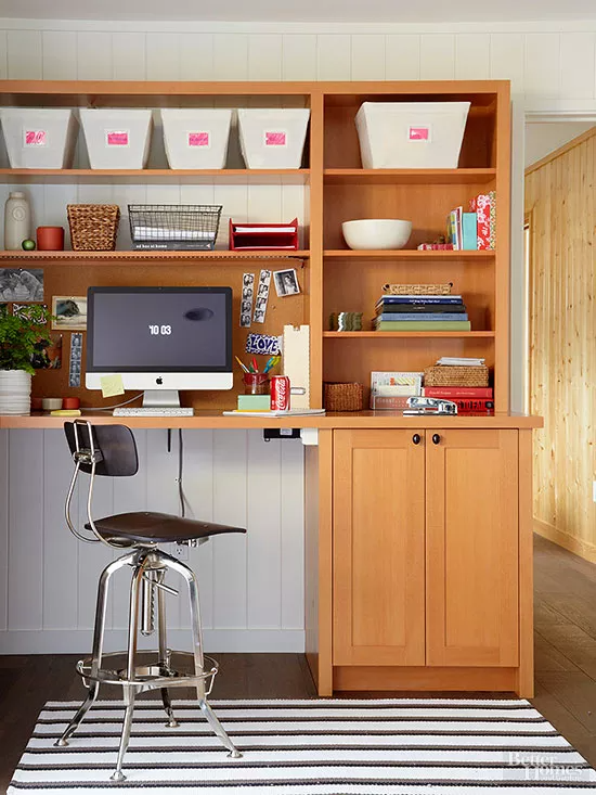
A built-in office nook adds function and storage to a sliver of space. Warmly stained cabinetry mimics the look of the paneling in the entry and primary bedroom.
Visual Expansion
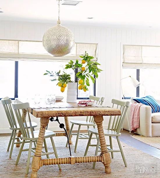
An airy dining table and chairs make the space feel bigger. Vertical paneling, painted white, lifts the eye so the ceilings appear higher. A dramatic light fixture provides impact without occupying too much physical space.